Hey! I’m Amy! I’m a graphic designer and photographer with a keen interest in app and web design, branding and all things print! I am curious about everything and love incorporating historical/cultural context within my design – recently I’ve been researching Celtic typography and the Book of Kells to design a magazine about Irish culture (Check out Celt mag at my stall!). Another aspect of design which is of utmost importance to me is design empathy and user needs. In designing an app centred around health (The Healing Garden), I have learnt how to design in response to specific user needs, tendencies, and pain points. User needs define how I design from start to end.
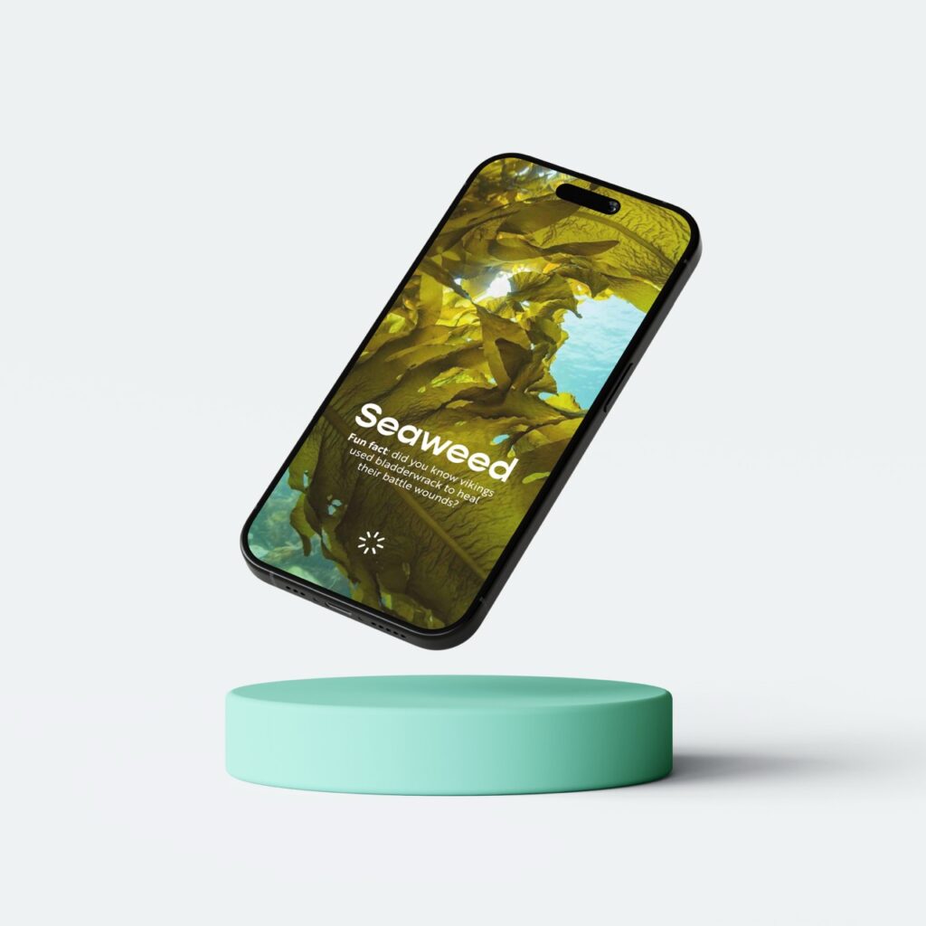
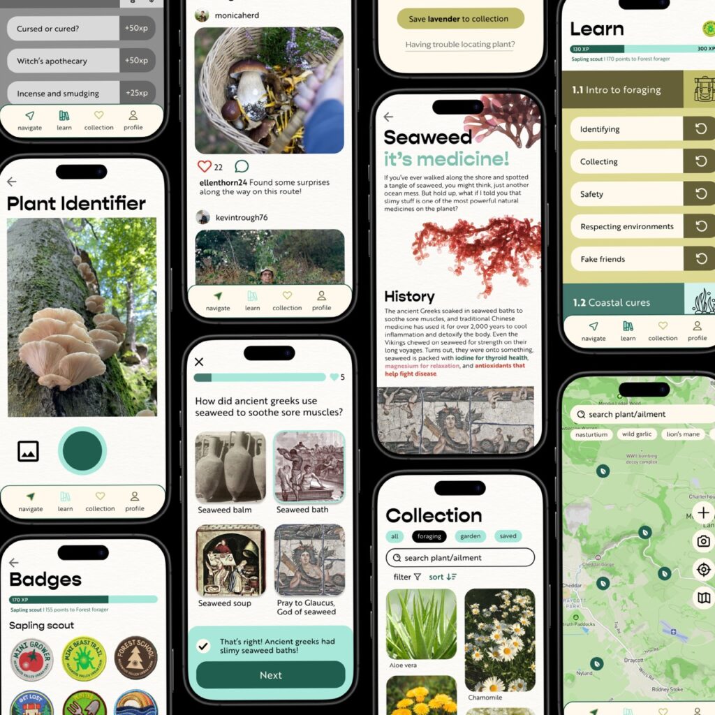
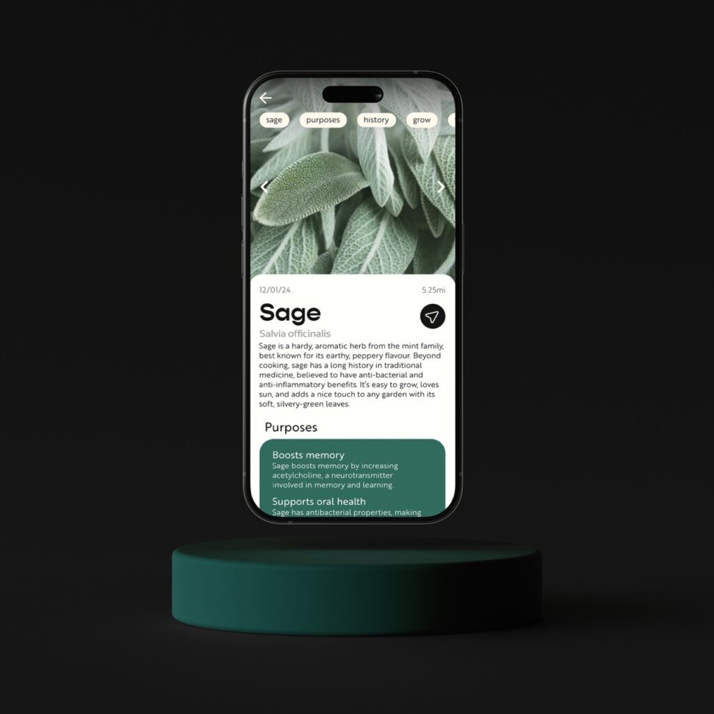
The Healing Garden is a forager’s pocket guide to finding, growing, and using native medicinal plants to solve minor ailments. My app is aimed at people who have a love for the outdoors and a love to learn. Whilst The Healing Garden is about medicinal plants, is it equally about inciting curiosity in users, aswell as enabling them to connect with nature. It includes a communal foraging map, a digital inventory of plants, AI photo plant identification, and interactive lessons on botany.
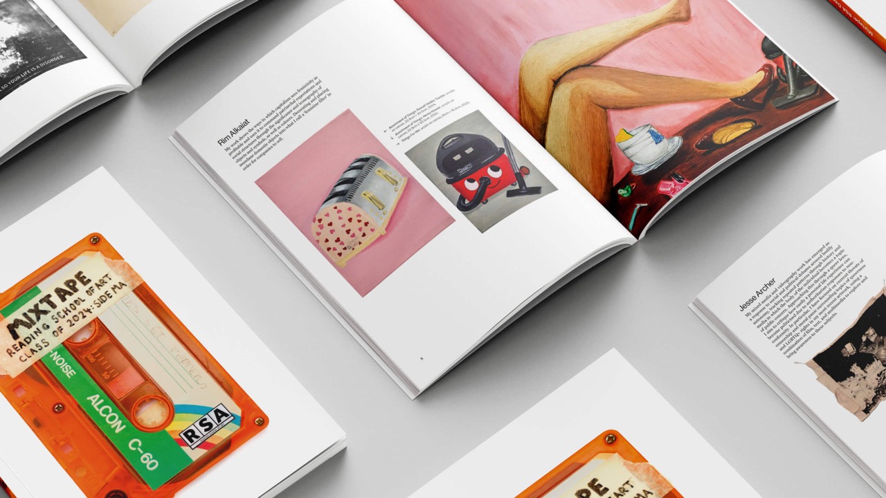
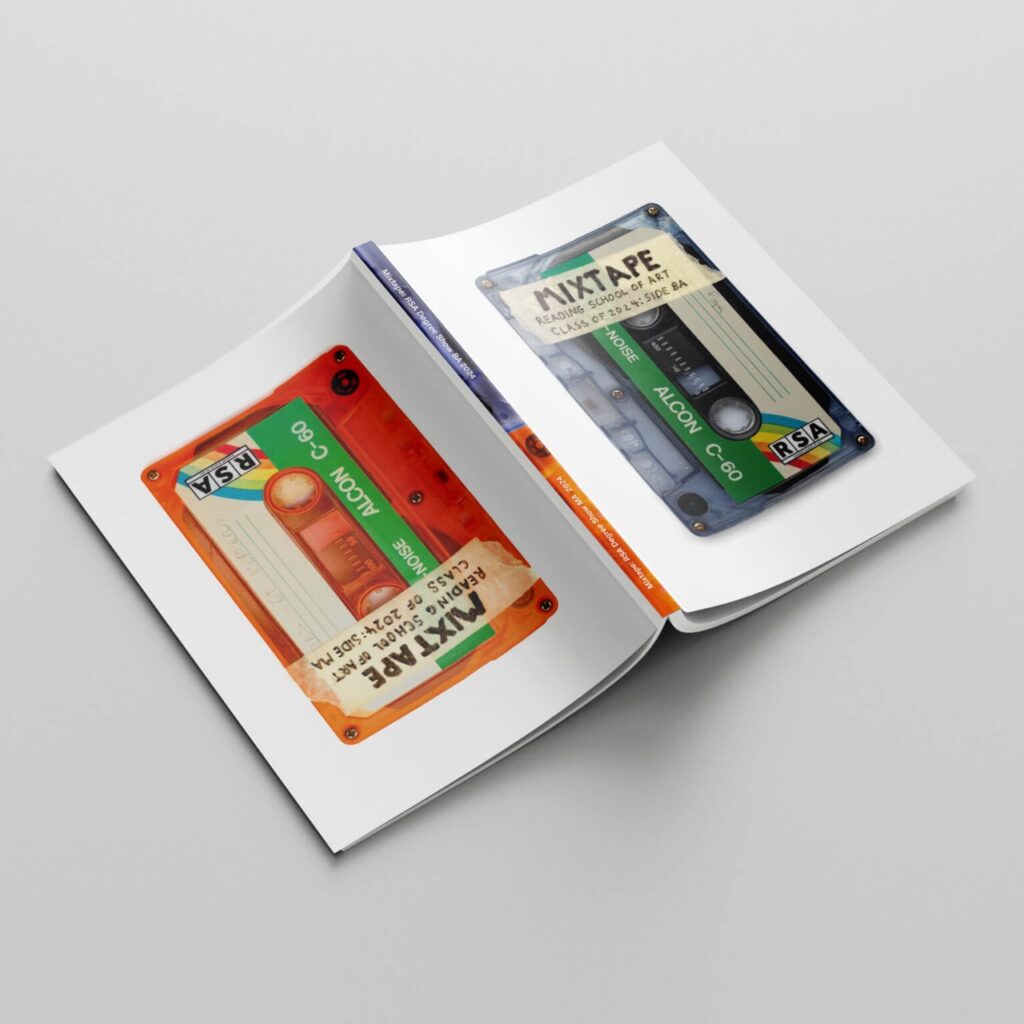
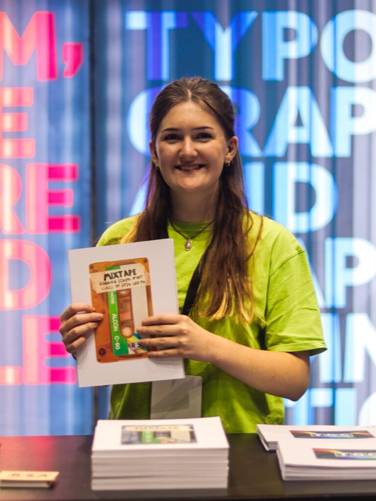
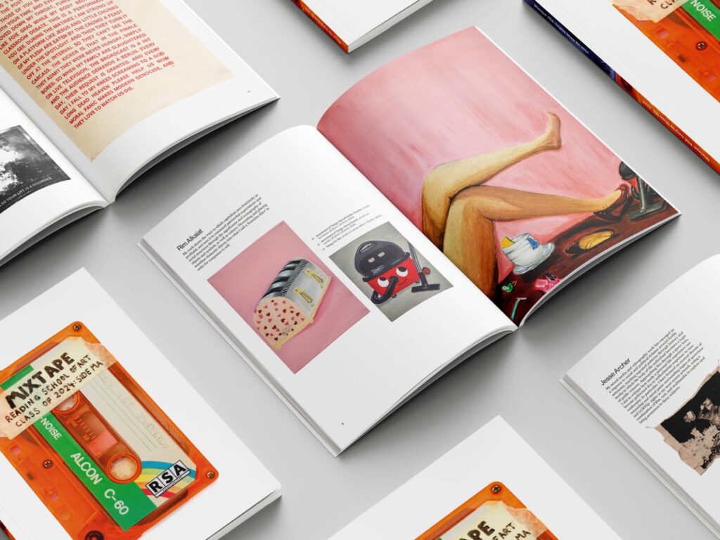
Mixtape catalogue
I had the amazing opportunity to lead the Reading School of Art degree show project, which involved liasing with Art students, lecturers, and printers, to create a print catalogue of the BA and MA Art students final work. This catalogue was used at open days and UCAS fairs to advertise the course, as well as acting as a portfolio for students. Where MA students often felt left out, always being a small section at the back of the book, we utilised a fun tête-bêche cover to create 2 entry points for readers, one for MAs and one for BAs!
I am a passionate graphic designer driven by a strong sense of creativity and attention to detail. I aim to push boundaries and create purposeful and engaging work that connects with my audiences. From branding to editorial and digital design, I approach every project with a fresh perspective.
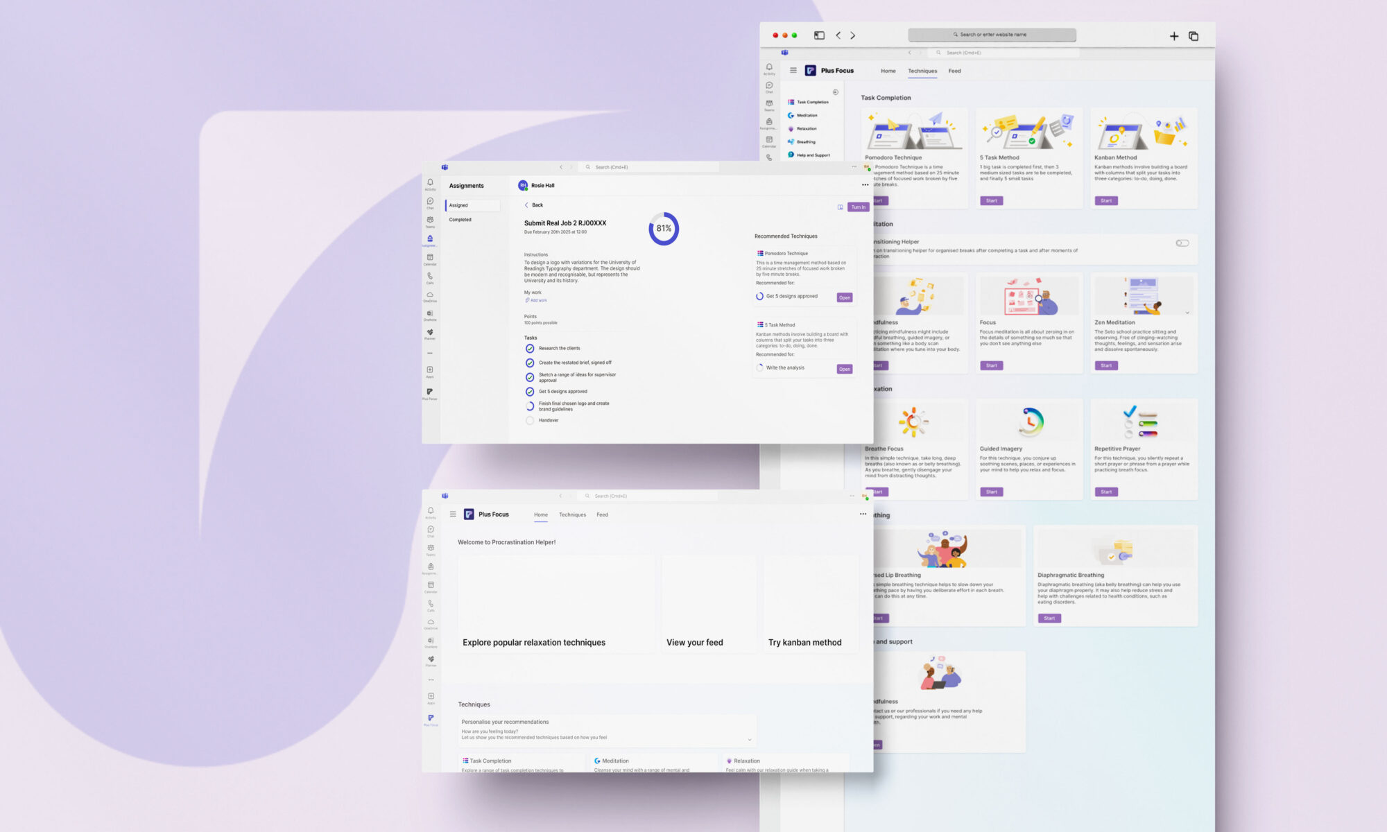
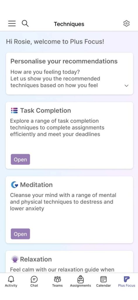
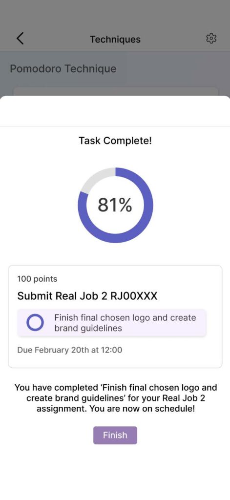
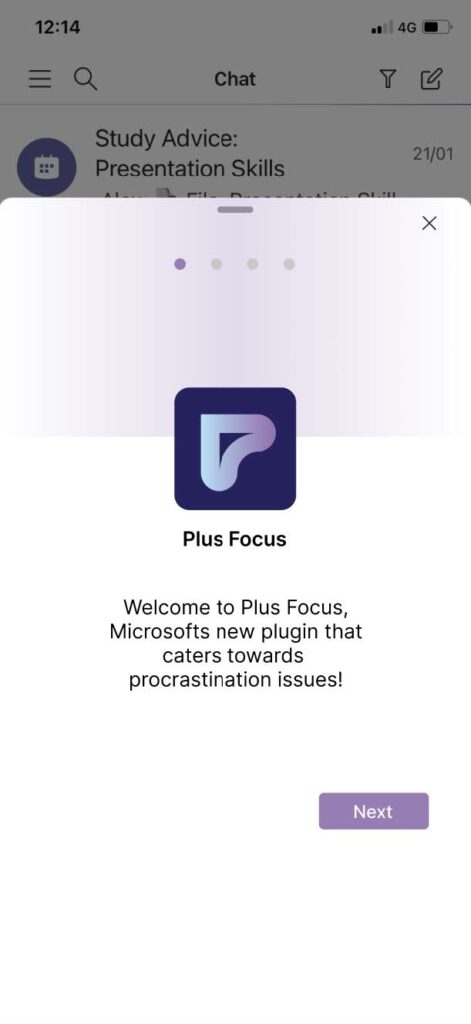
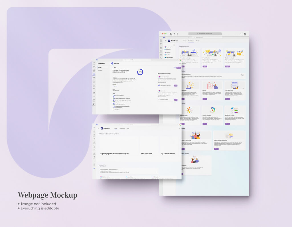
Plus Focus is a Microsoft Teams plugin that aims to reduce procrastination and stress. With a wide range of techniques to complete tasks efficiently or relieve anxiety, Plus Focus helps university students submit their assignments on time to the best of their ability.
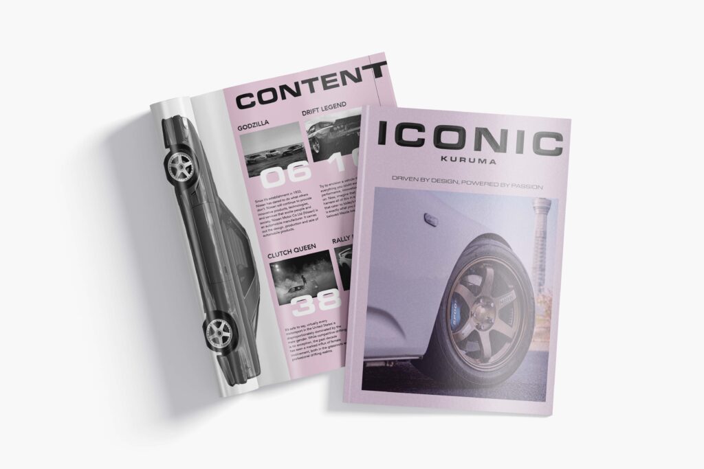
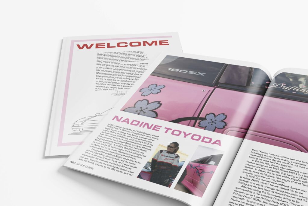
Iconic Magazine
ICONIC is an independent magazine that highlights and celebrates the most famous cars from each country. With the Kuruma edition focusing on the iconic drift cars from Japan, each edition aims to take you on a global journey, spotlighting the most famous and culturally defining cars from different countries. With rich visuals, deep dives into design and heritage, and exclusive stories behind the world’s most celebrated machines, drivers, and popular movie appearances. It’s driven by design and powered by passion.
During my time at Reading, I’ve developed a strong foundation across editorial, branding, and UX design. I’m especially drawn to projects that balance clarity with expression, using typography, texture, and imagery to create meaning. I’m excited to continue growing as a designer and explore new creative challenges.
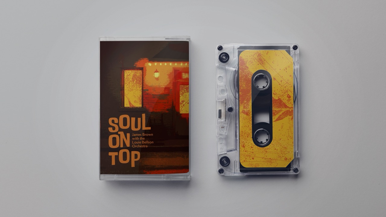
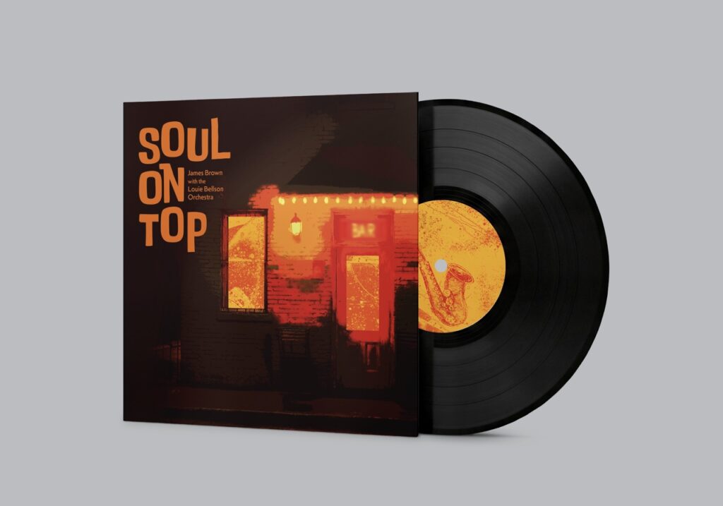
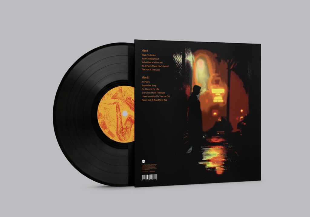
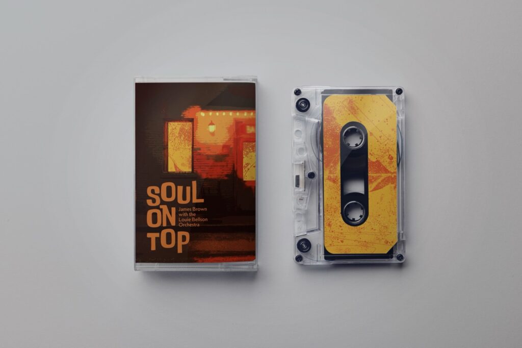
A re-design of James Brown’s album cover for ‘Soul on Top’. The visual concept captures the atmosphere of a late-night jazz bar, with the front cover presenting a moody and cinematic feel. As the vinyl is opened, the design transitions to a vibrant, expressive inner sleeve and record sticker, capturing the energy and funk of the music inside.
Sonic Journals
‘Sonic Journals’ is an independent music magazine, with each edition offering a deep dive into a specific music genre. The magazine explores key artists, albums as well as the genre’s wider impact on society and culture. The visual design is influenced by punk Fanzines from the 1970s/80s to create a personal and authentic aesthetic.
Hi, I’m Vivien! I’m a hard-working and versatile graphic designer with interests in the editorial and entertainment industries, though my strength in layout design encourages me to pursue projects outside of these as well. I am a proactive learner, with skills learnt and developed in Adobe Photoshop, Illustrator, InDesign, Premiere Pro and Figma. My time at University has also enabled me to grow skills in Photography, Videography and Video Editing, as well as communication, leadership and organisation. Using the knowledge learnt and experience gained from this course, I am confident and ready to face more challenges, solve more problems and further hone my skills in the professional industry after graduating.
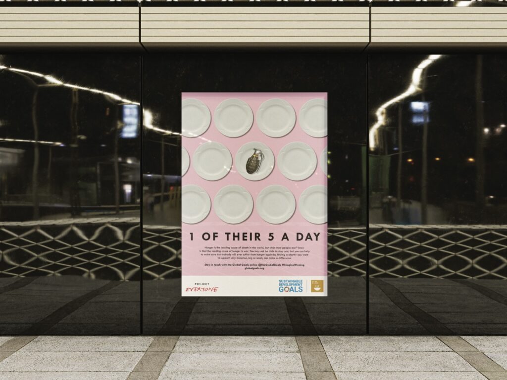
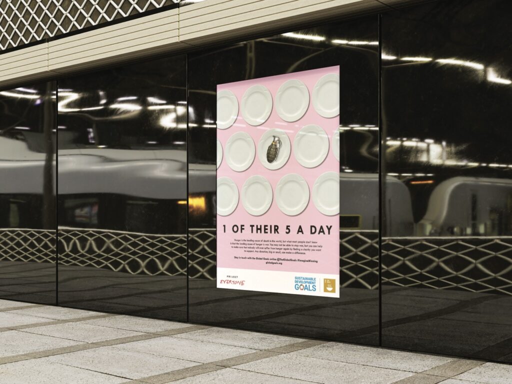
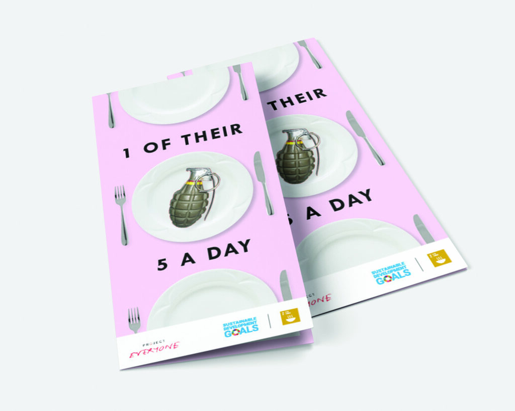
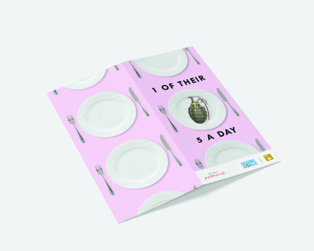
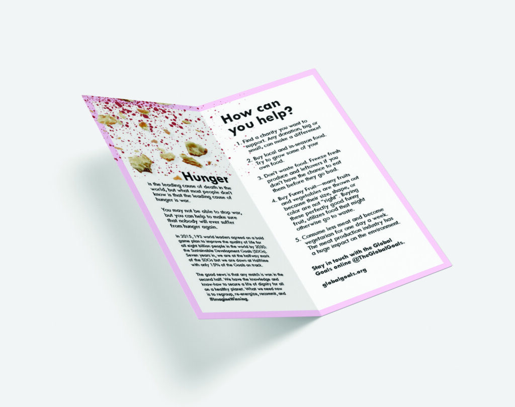
Goal 2 of The Global Goals is ‘Zero Hunger’, its official mission statement being to “End hunger, achieve food security and improved nutrition, and promote sustainable agriculture”. In collaboration with this, I designed a poster and leaflet to bring awareness and encourage action towards the fulfilment of this goal. The number one cause of world hunger is war, and my designs aim to inform audiences of this fact to highlight the devastating severity of world hunger. Using the widely known ‘5-a-day’ phrase, my outputs show how those suffering from world hunger consume war – in the form of a grenade on a plate – instead of the fruit and vegetables that the ‘5-a-day’ phrase is associated with. This message is further developed in the leaflet through the overlap of splattered crumbs and blood on the first page that surround the word ‘Hunger’. The shock-value of these motifs hope to motivate audiences to take action.
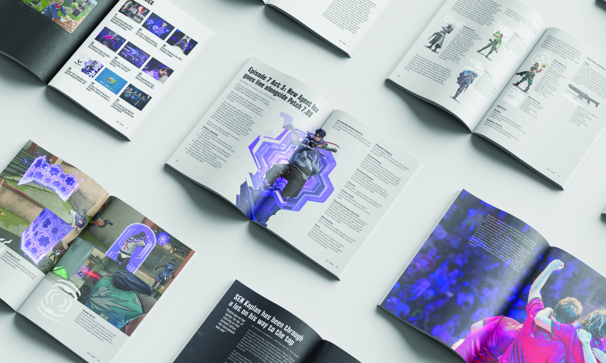
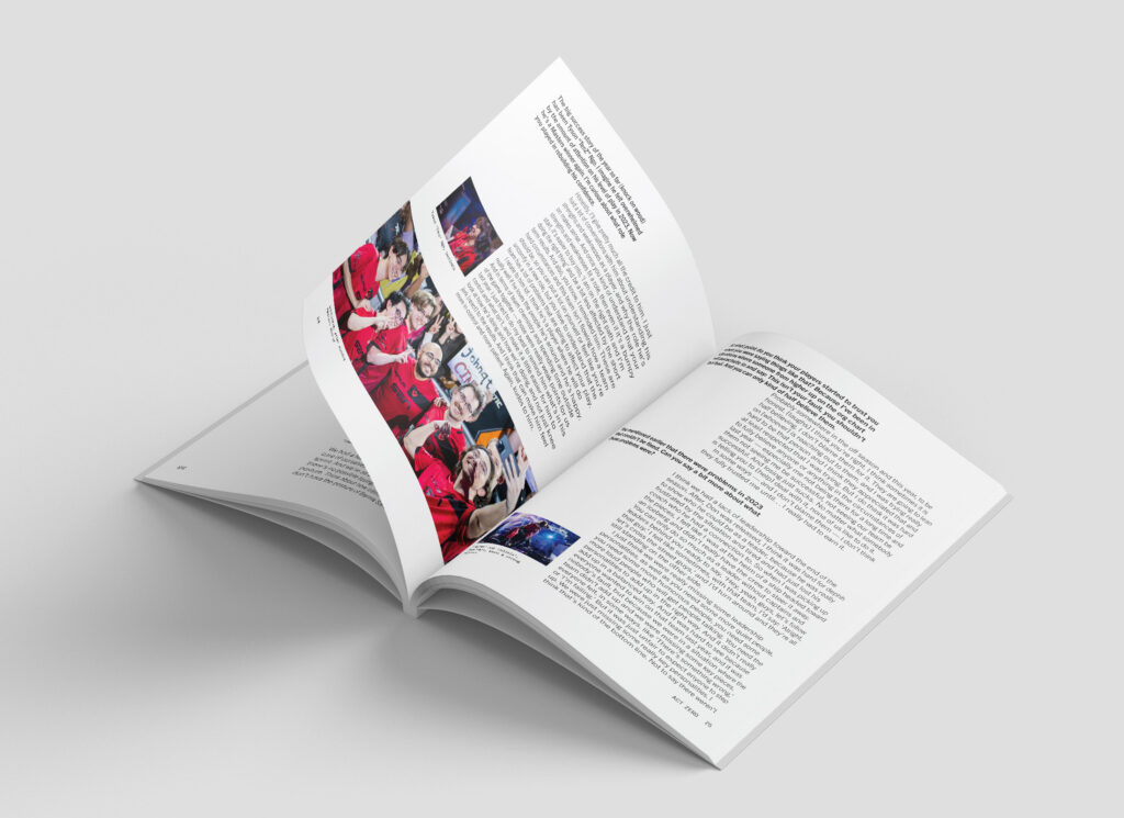
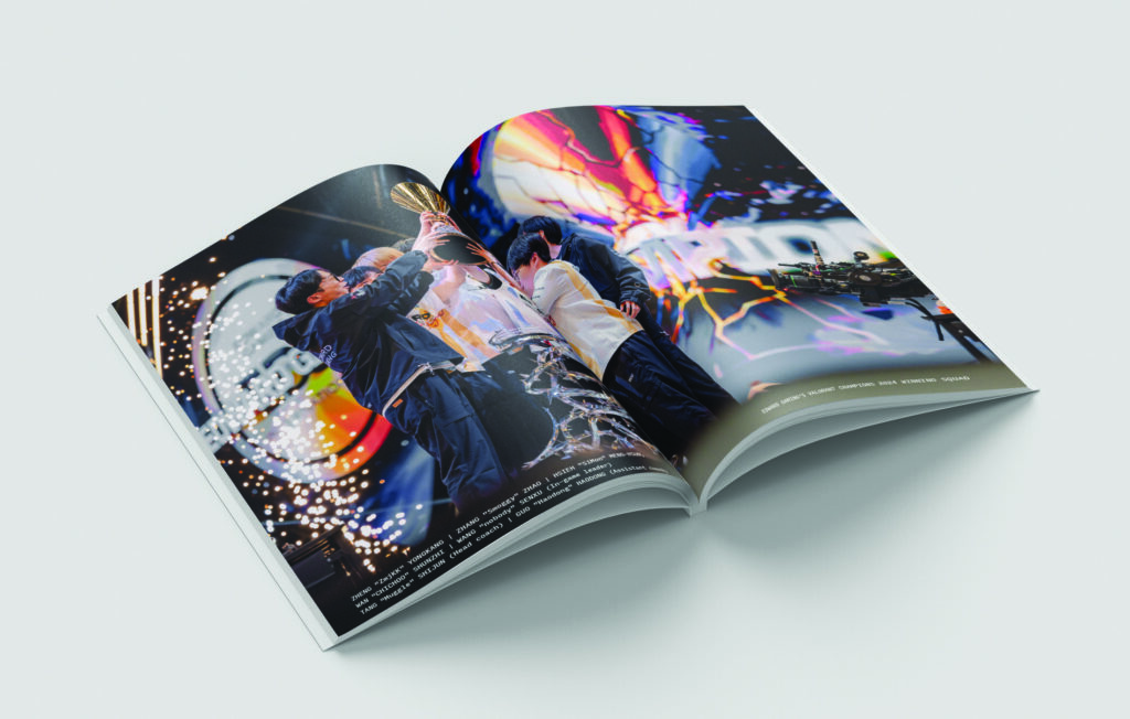
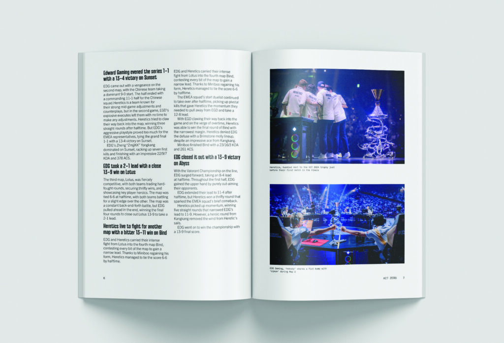
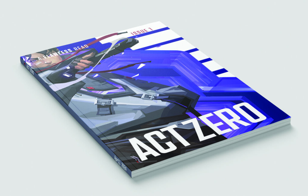
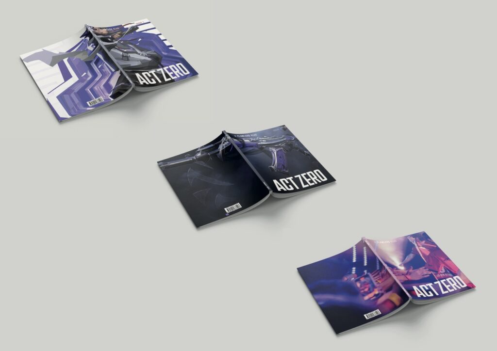
ACT ZERO
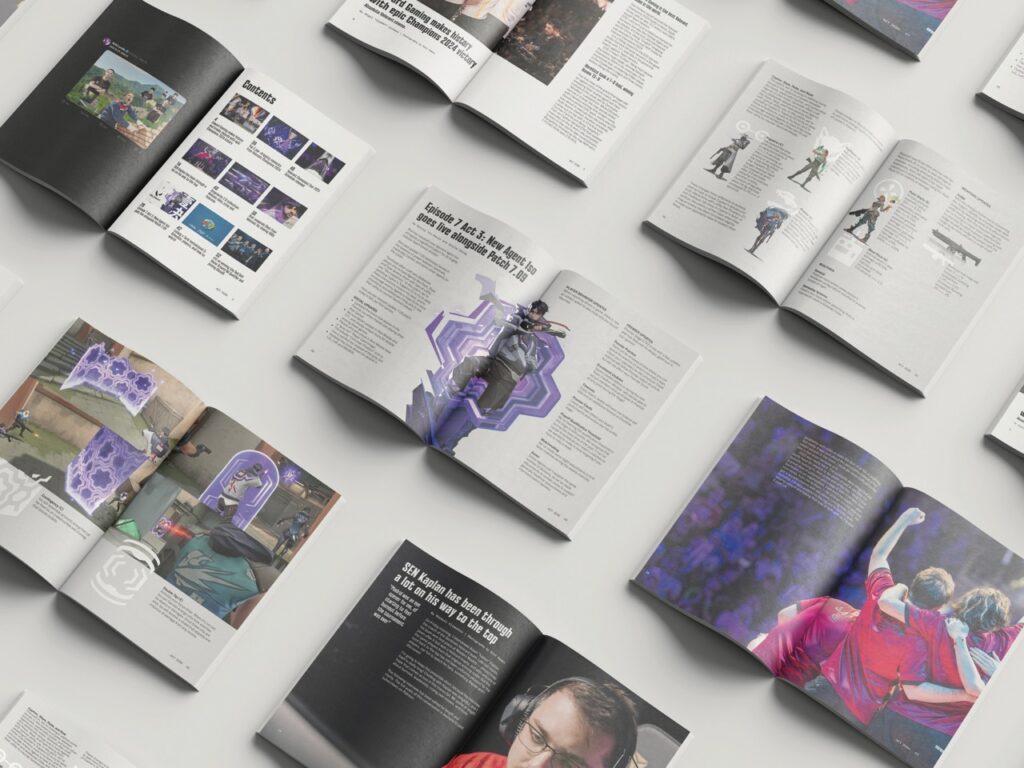
ACT ZERO is an independent magazine that publishes issues monthly for those interested in the video game, Valorant. Its contents cater to audiences with any level of interest in the game, whether as a serious player, casual viewer or game analyser. Through articles and images, readers are informed about the game’s updates, its Esports tournament series VCT (Valorant Champions Tour) and interesting interviews with relevant figures in the scene. ACT ZERO uses layouts heavy in both illustrations and photography from the game and its events for visual appeal and to garner appreciation for the work put into them. A flawless read is guaranteed!
Over my 3 years at Reading I have flourished as a designer through the help of the staff and course mates. As a result I have become confident in my abilities in visual communication while gaining a great appreciation for design styles like Swiss Design as well as the micro details of the design process. The range of diverse projects throughout my time has enabled me to become a highly skilled designer, from UX to editorial design to branding. All of this has translated to real-world applications where I have worked with multiple clients through real jobs as well as personal projects, such as running social media.
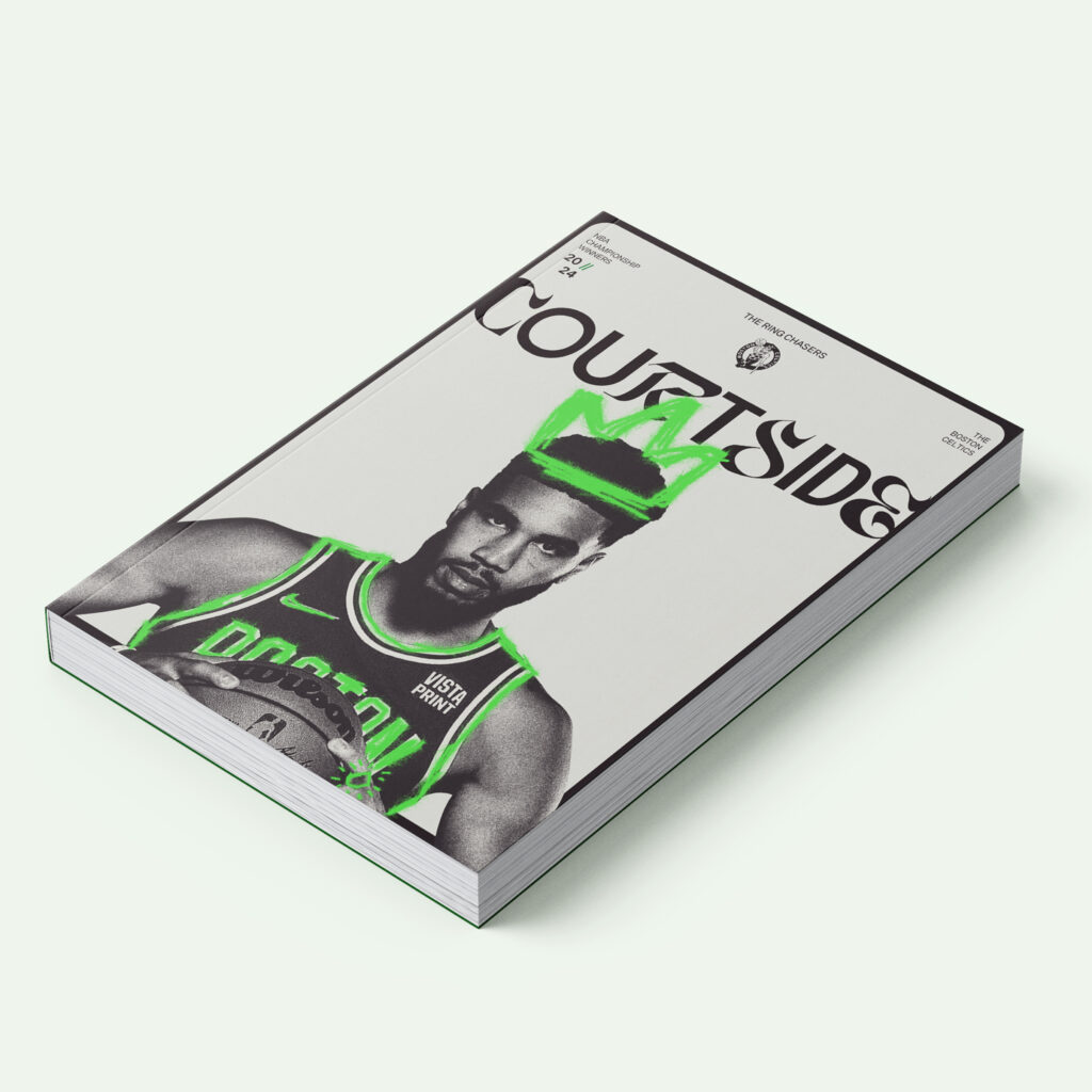
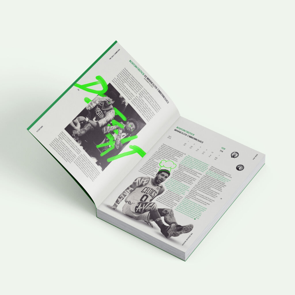
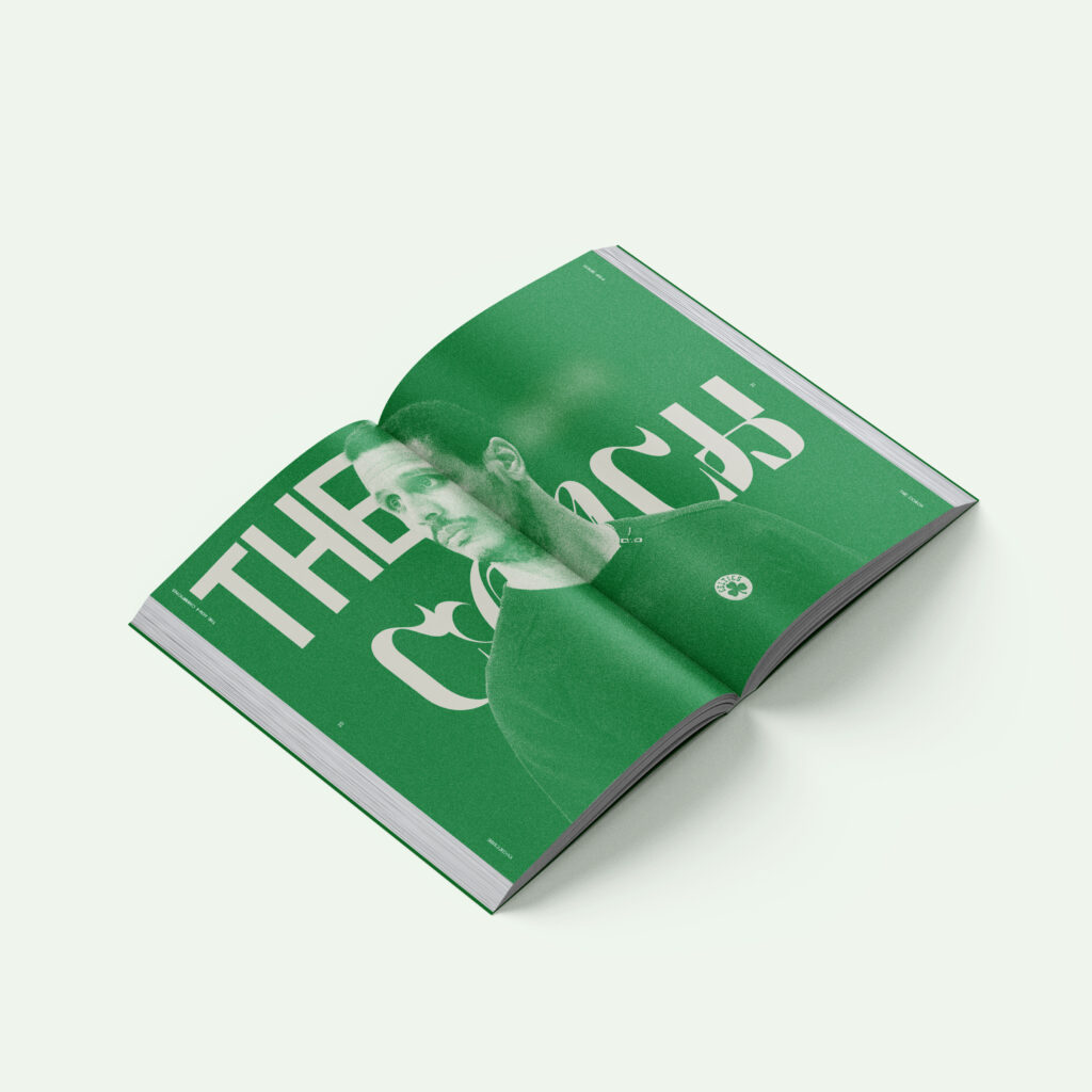
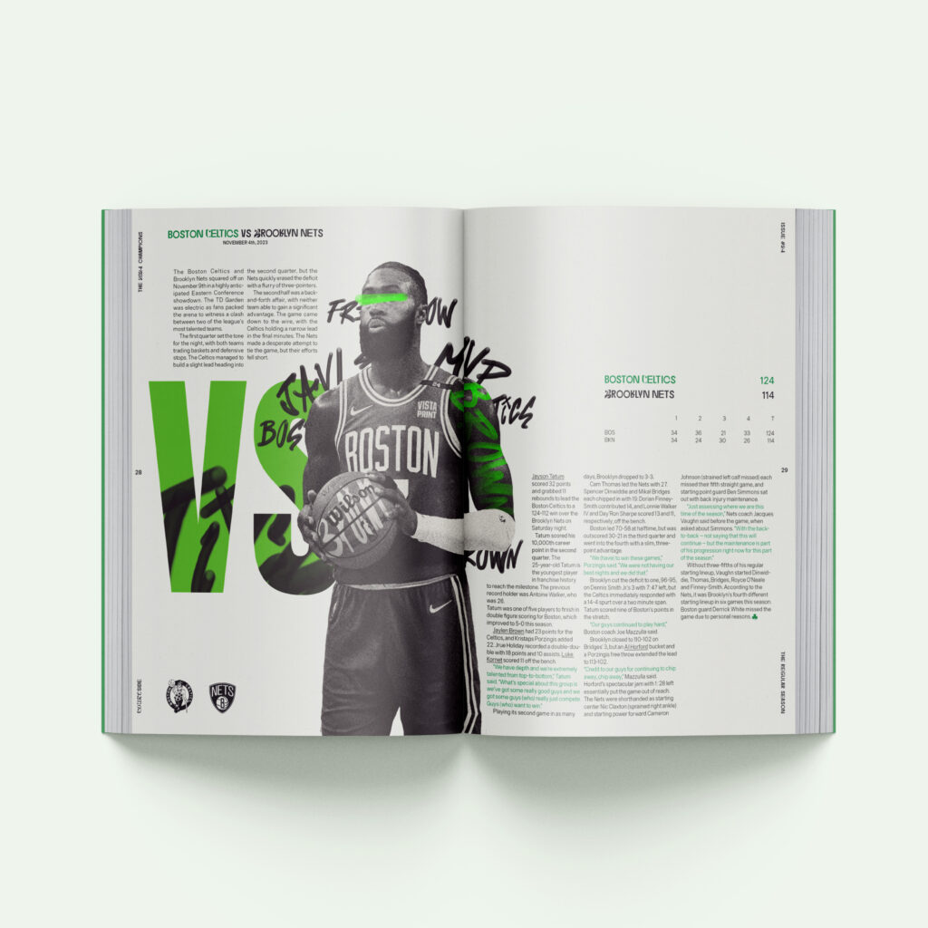
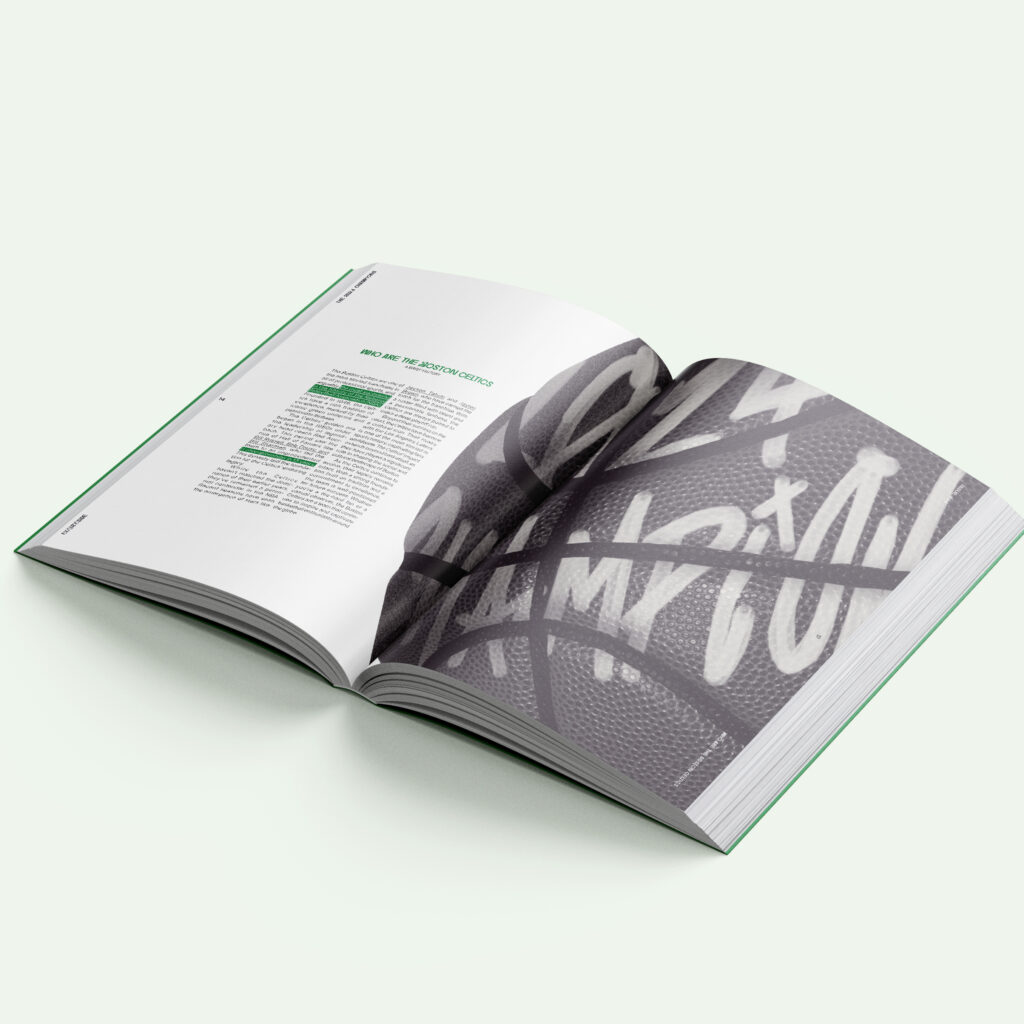
Courtside is an NBA-based magazine which covers the yearly NBA champion winning team, in this case the Boston Celtics. The magazine showcases the team’s success and struggles through the year alongside results, player transactions, player and coach interviews and game recaps. All of this is encapsulated under an urban design style with graffiti type to tie back to the history of the game and the global influence it holds.
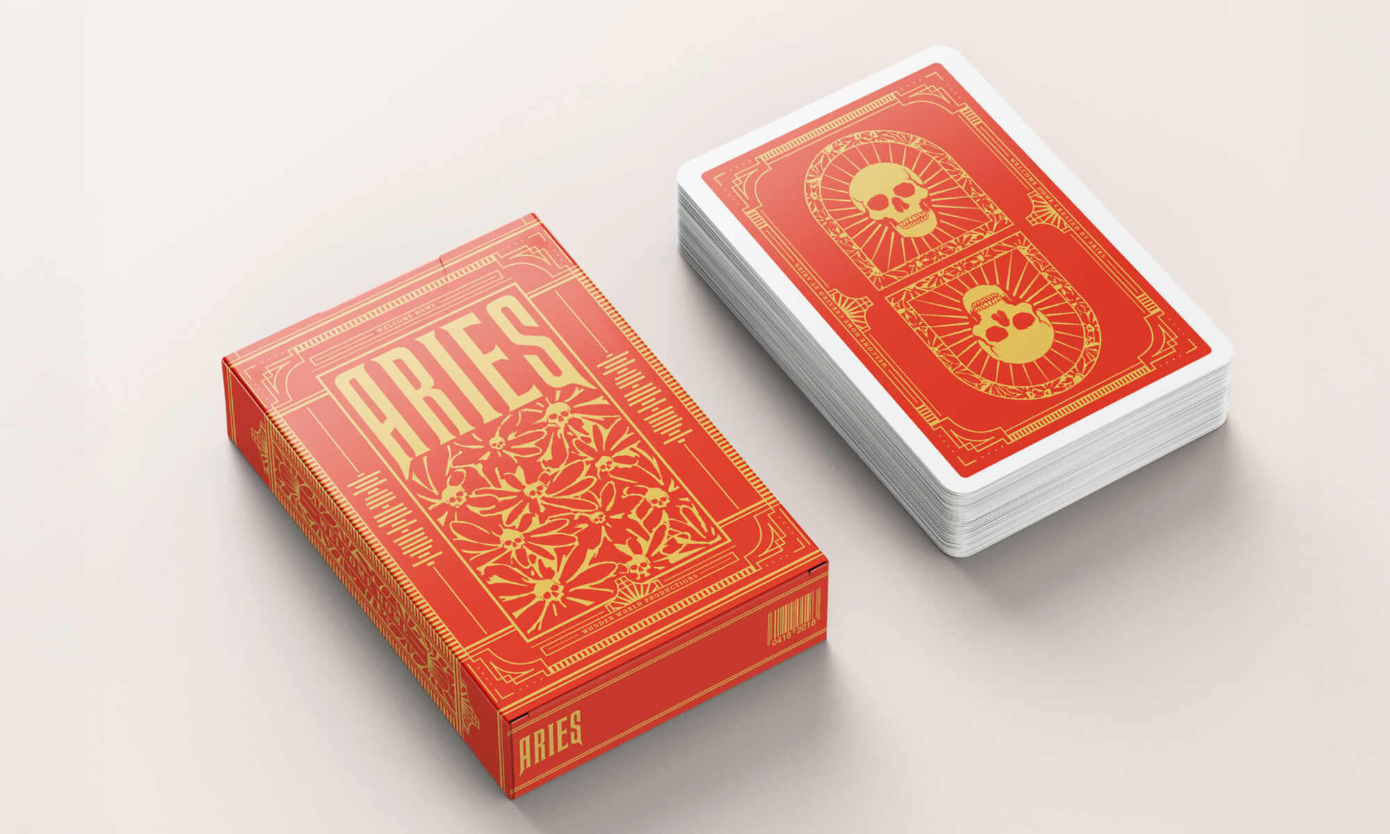
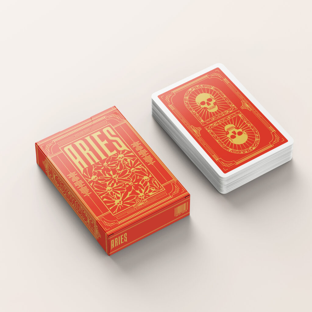
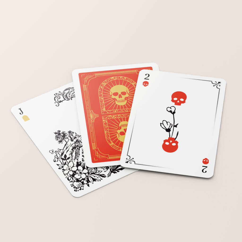
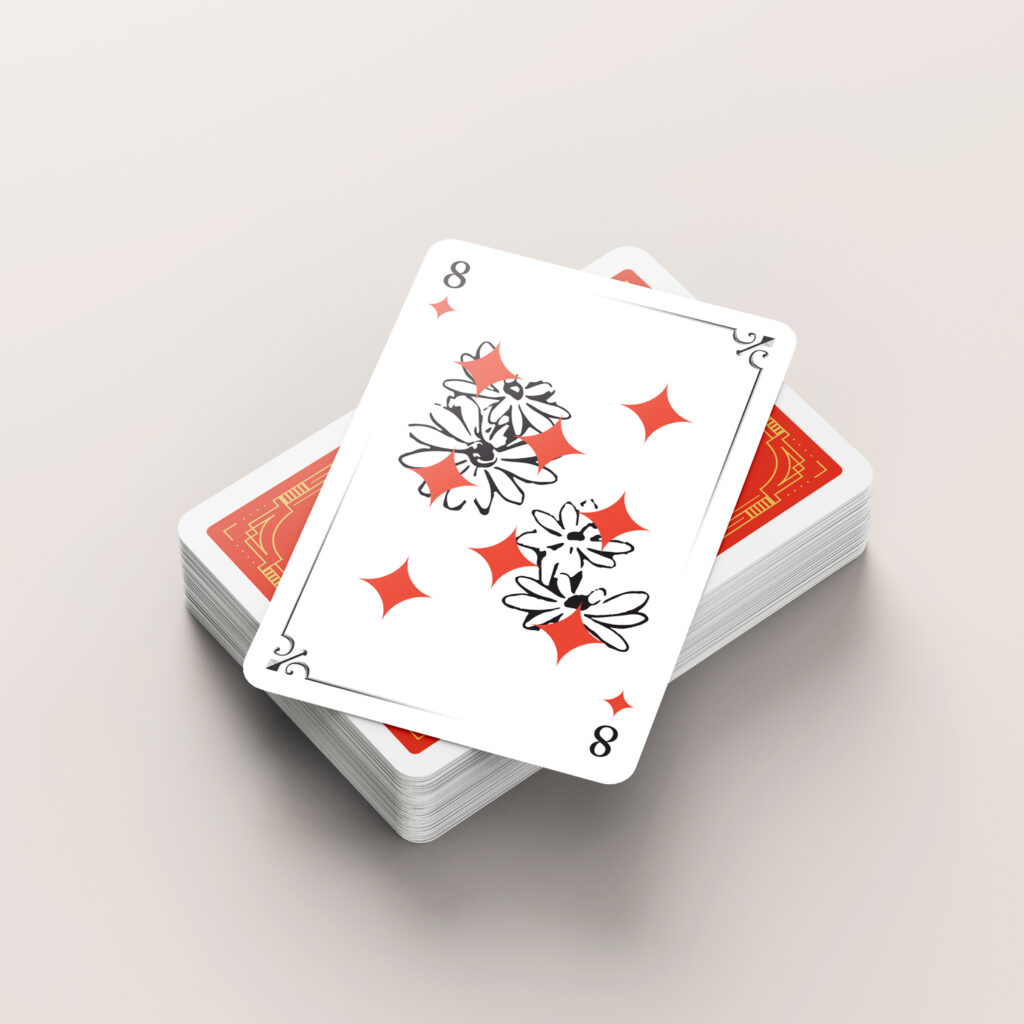
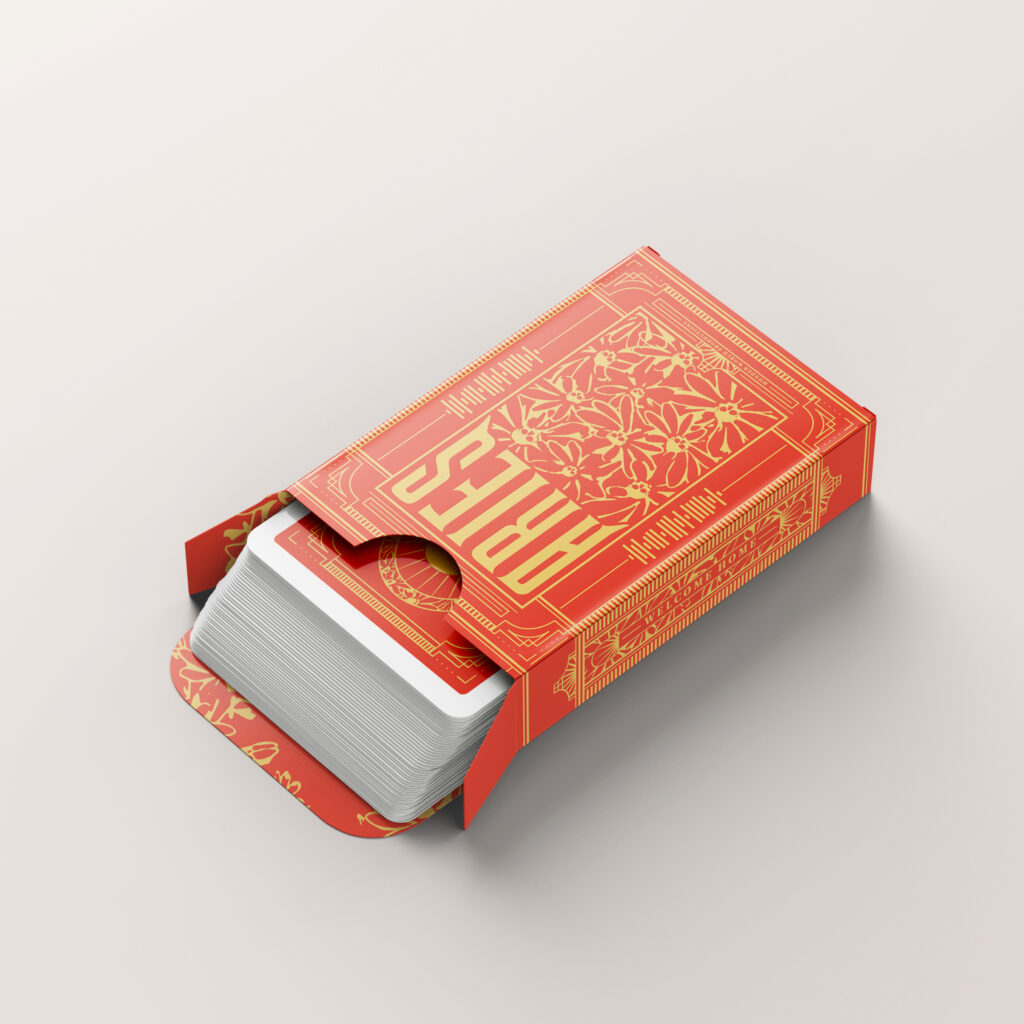
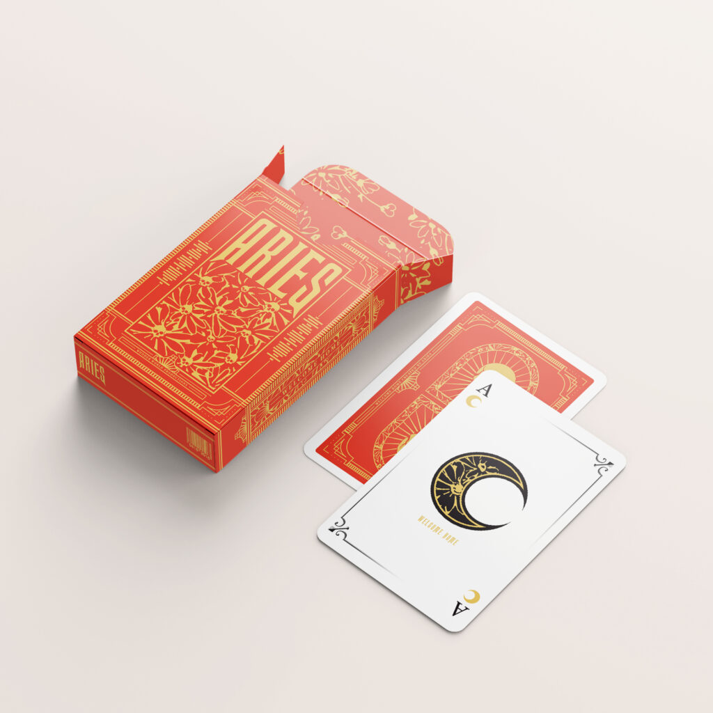
Aries WELCOME HOME
Aries released the ‘WELCOME HOME’ album in which a full repackage was held to refocus the album in line with the artist and his music. Within this project one of the products I created was a pack of playing cards. The box utilised the colours relating to the artist’s heritage with a hidden Spotify link to the album and the main theme showcasing life and death. While the cards were reimagined with new suit icons and additional imagery embedded that related to the album cover redesign.
Hi, I’m Dylan! Through my studies at the Typography department, I’ve developed a keen interest in both digital product and packaging design. What unites these fields is the importance of User Experience and incorporating UX principles into my design process to create empathetic, valuable, and engaging products is something I find deeply fulfilling. This is something I’d like to explore further professionally, whilst developing my broader creative skillset. Maintaining a dedicated and ambitious mindset, under pressure and in the face of adversity, is something I take great pride in. I’m committed to the journey of improving my philosophy and workflow to become the best designer I can be and look forward to pushing myself further.
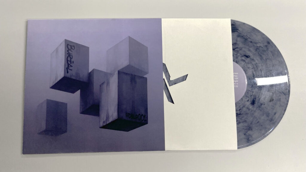
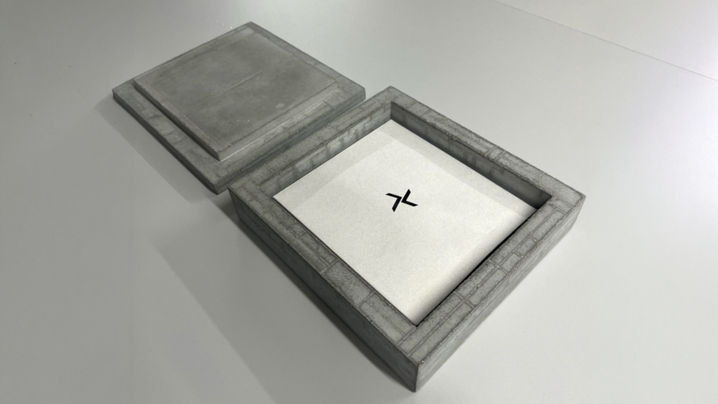
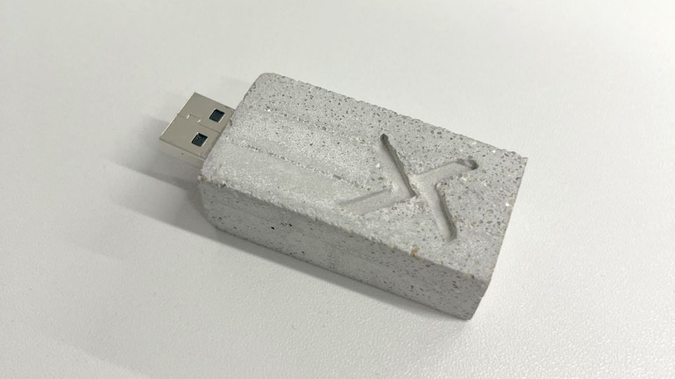
A response to the Packaging project brief: A redesigning of the electronic artist Burial’s self-titled album. To mirror the surreal and introspective sonic space of ‘Burial’ (inspired by life in early 2000s South London), I envisioned concrete floating, fragmented into blocks, and fading into the distance, creating an unfamiliar, dystopian atmosphere. This brief gave me the excuse to explore spectrogram software, 3D modelling software, and even physically casting concrete to produce collector’s edition items.
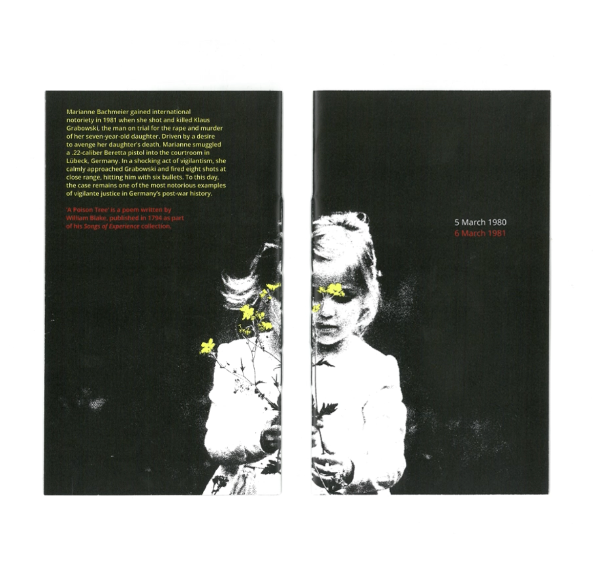
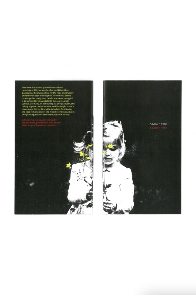
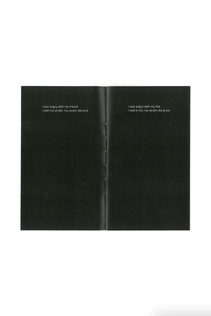
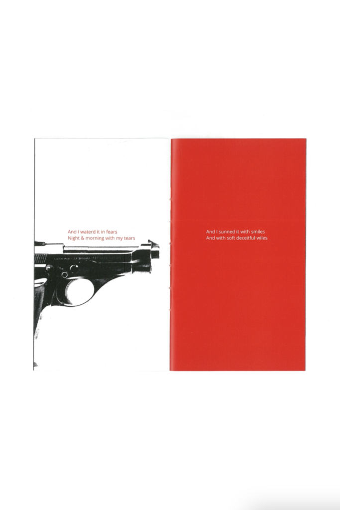
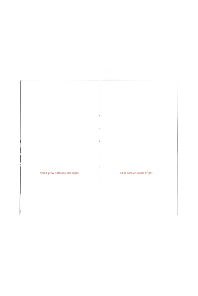
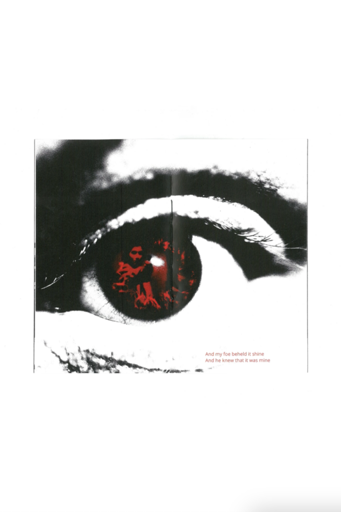
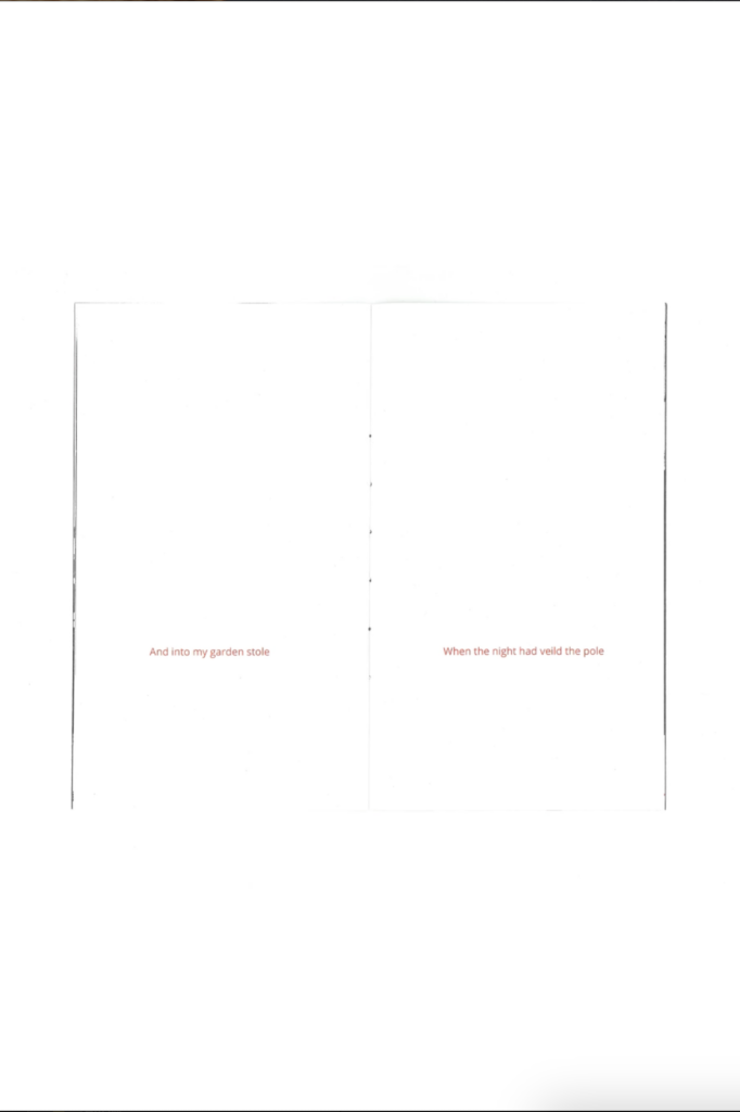
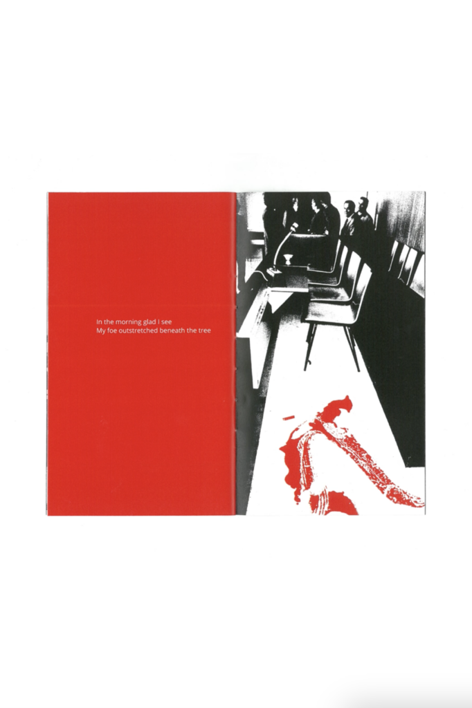
A Poison Tree
xA response to the Word & Image project brief: A short booklet combining the narratives of William Blake’s poem ‘A Poison Tree’ and the revenge story of Marianne Bachmeier. Working on this project helped me develop an appreciation for the versatility of sequential contexts and how word and image can be used creatively within these. Using the format of a booklet as a basis for playing with temporality was a particularly interesting and new learning experience. This is something that I fully embraced in my design approach, and I feel confident that this comes across through my use of symmetry.
Hey, I’m Emily! I would describe myself as a detail-oriented creator with a love for storytelling through visuals, who experiments with imagery and layout to create designs ranging from big to small. While studying at the University of Reading, I developed a love of using Illustrator and InDesign and enjoy the process of turning ideas into clear, engaging visuals and finding the balance between creativity and communication.
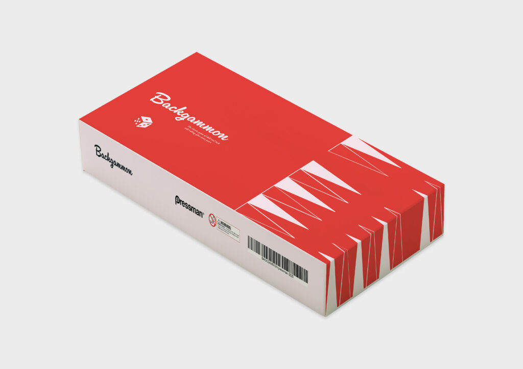
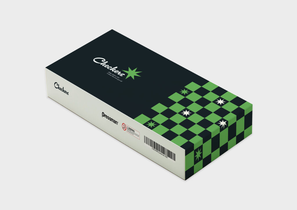
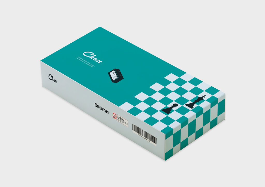
Reimagined board game packaging design for Pressman’s folding board collection. I drew from the company’s long history and wanted to create a sense of nostalgia, inspired by 50’s America, that would appeal to adults and children alike.
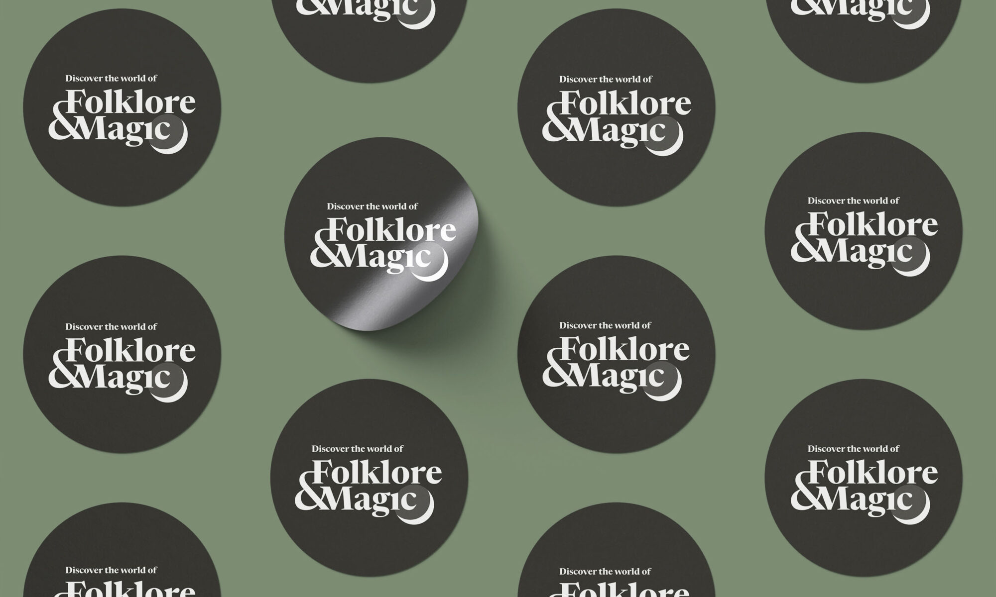
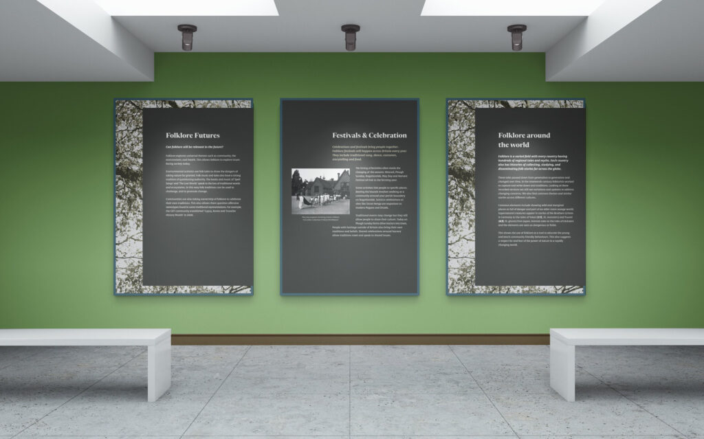
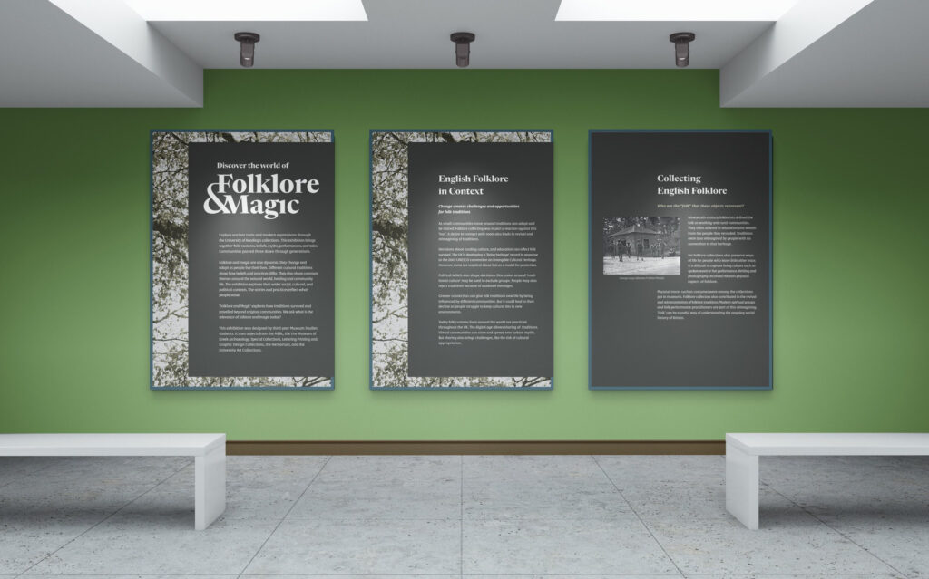
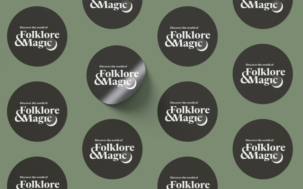
Folklore & Magic
Panels for the third-year museum-studies exhibition: Folklore & Magic. I was inspired by the space of the exhibition as well as the subject’s themes of nature and storytelling.
I am passionate about creative design and always on the lookout for innovative ways to solve problems. I love editorial design and enjoy crafting unique, meaningful visuals that stand out. I prioritise intentionality in my process, ensuring every piece has purpose behind it. Confident in Figma and AfterEffects, with a strong foundation in Indesign, Photoshop and Illustrator – always eager to learn and expand my skill set.
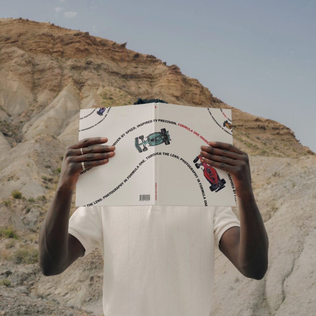
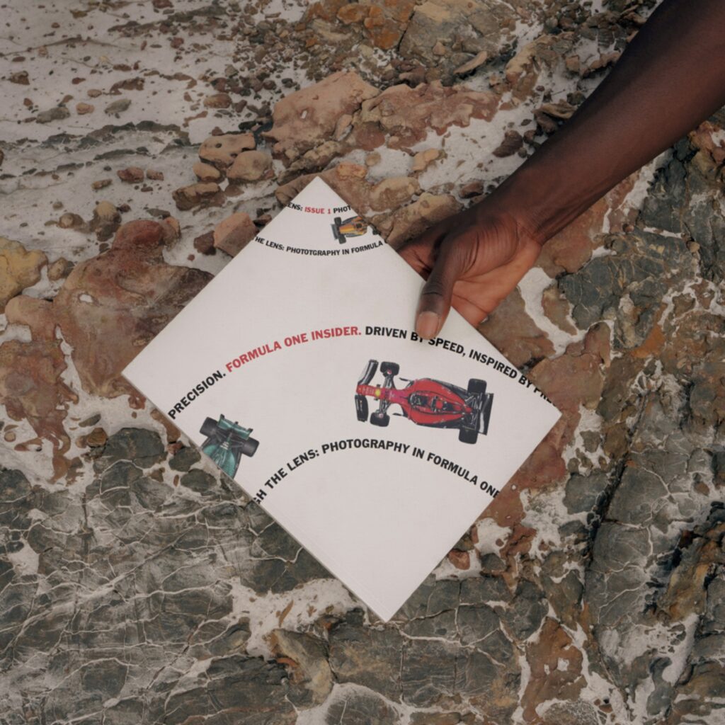
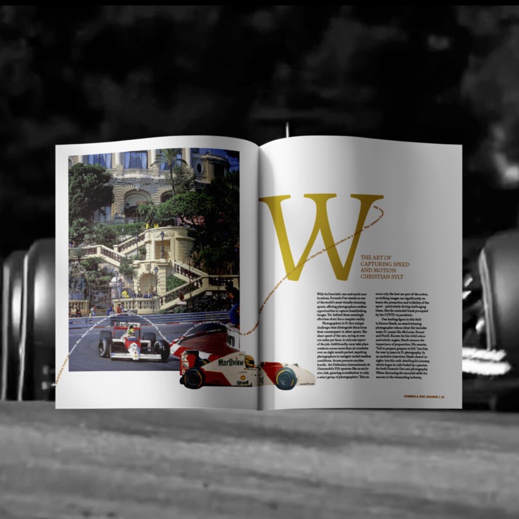
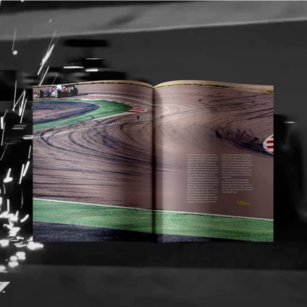
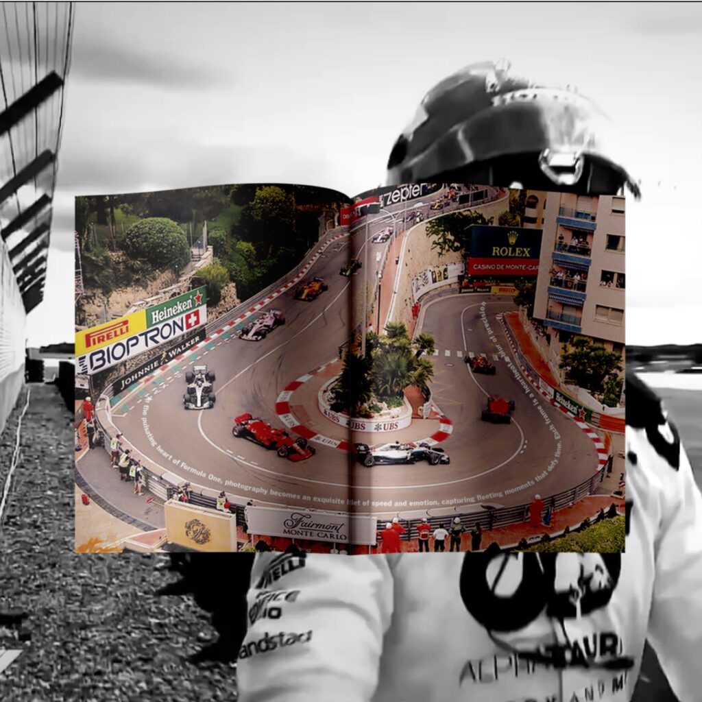
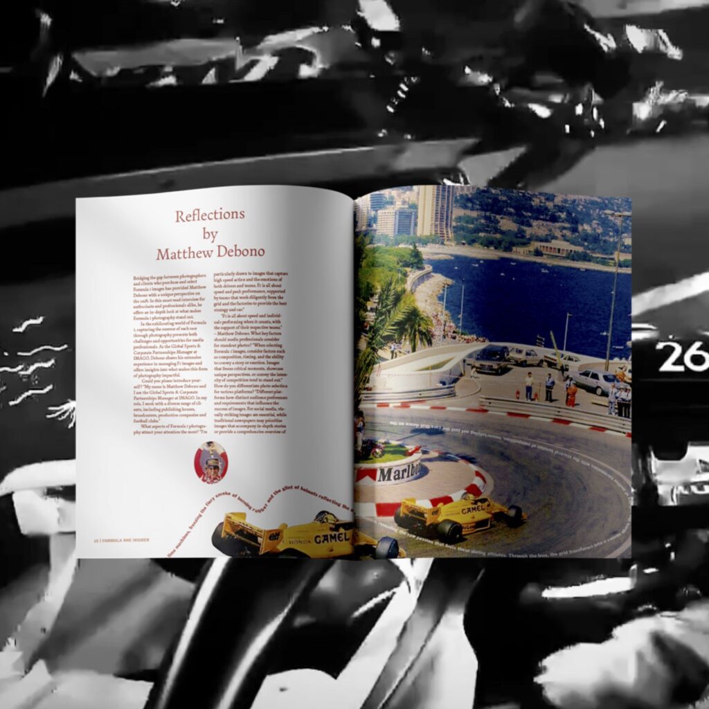
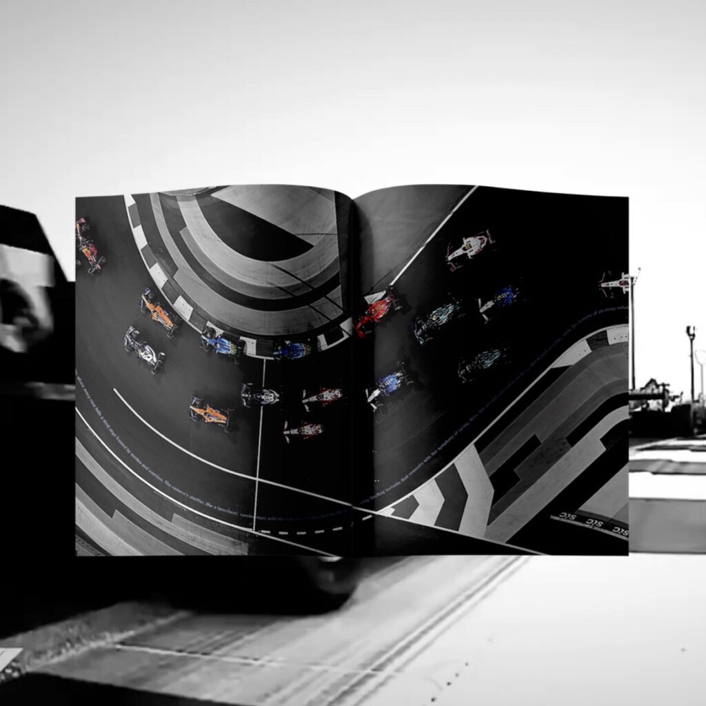
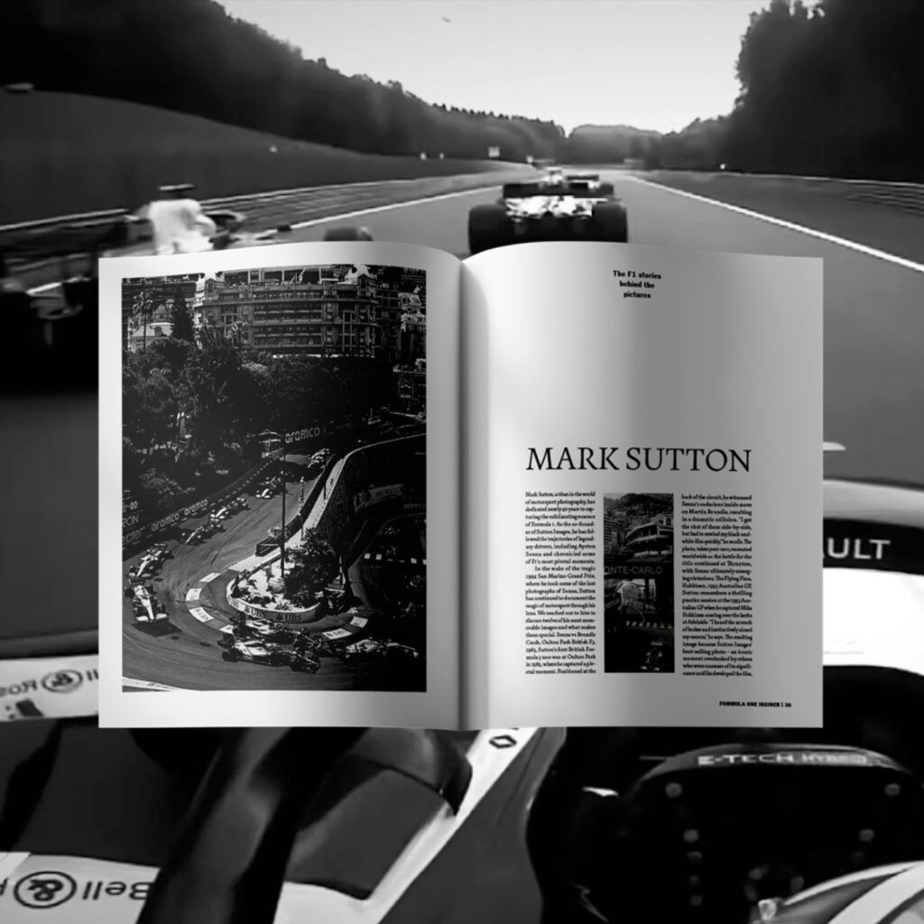
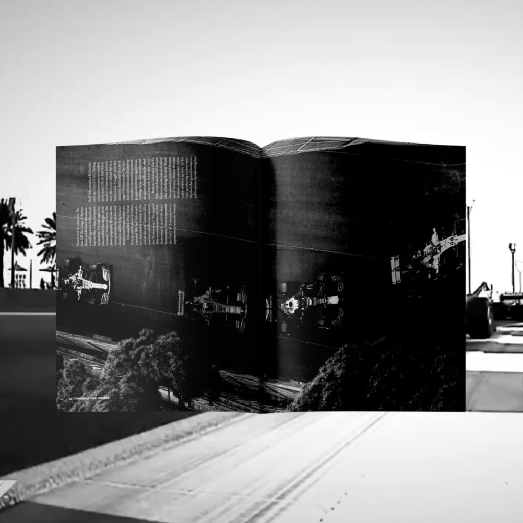
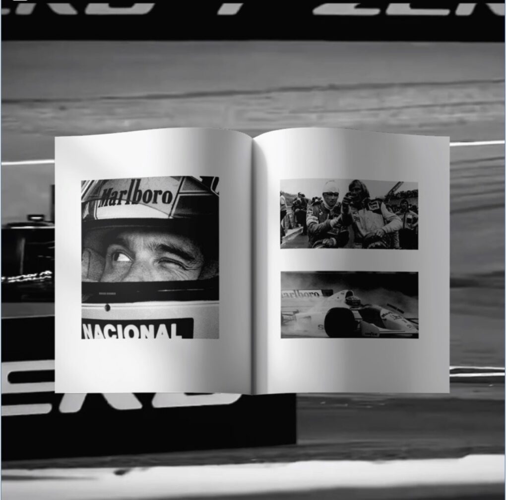
Formula One insider is a magazine crafted for F1 enthusiasts. Issue 1, titled Through the lens, focuses on the art of F1 photography. It features interviews with leading photographers, showcases vintage memorable shots and offers tips for capturing the excitement of F1.
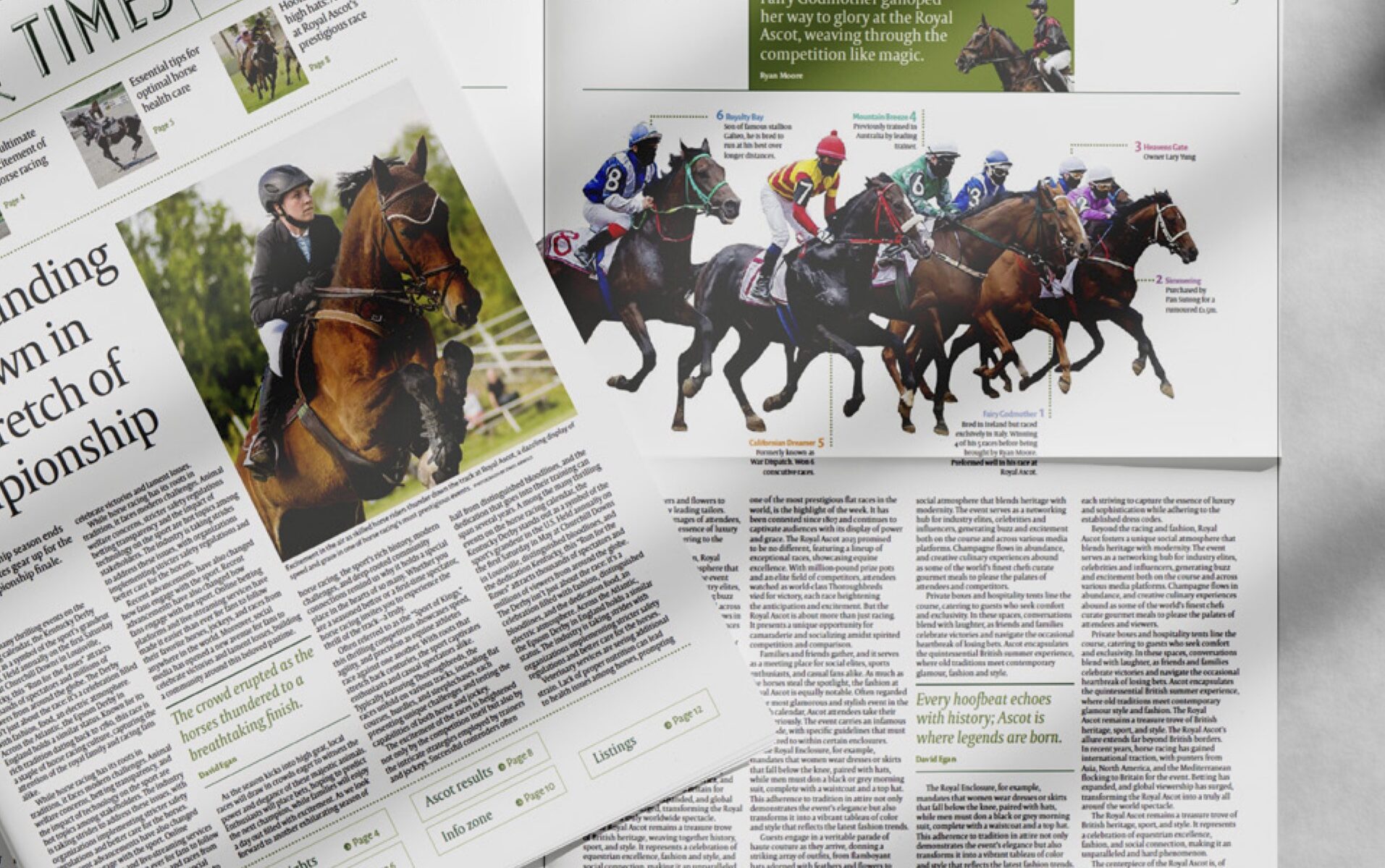
Riding Times
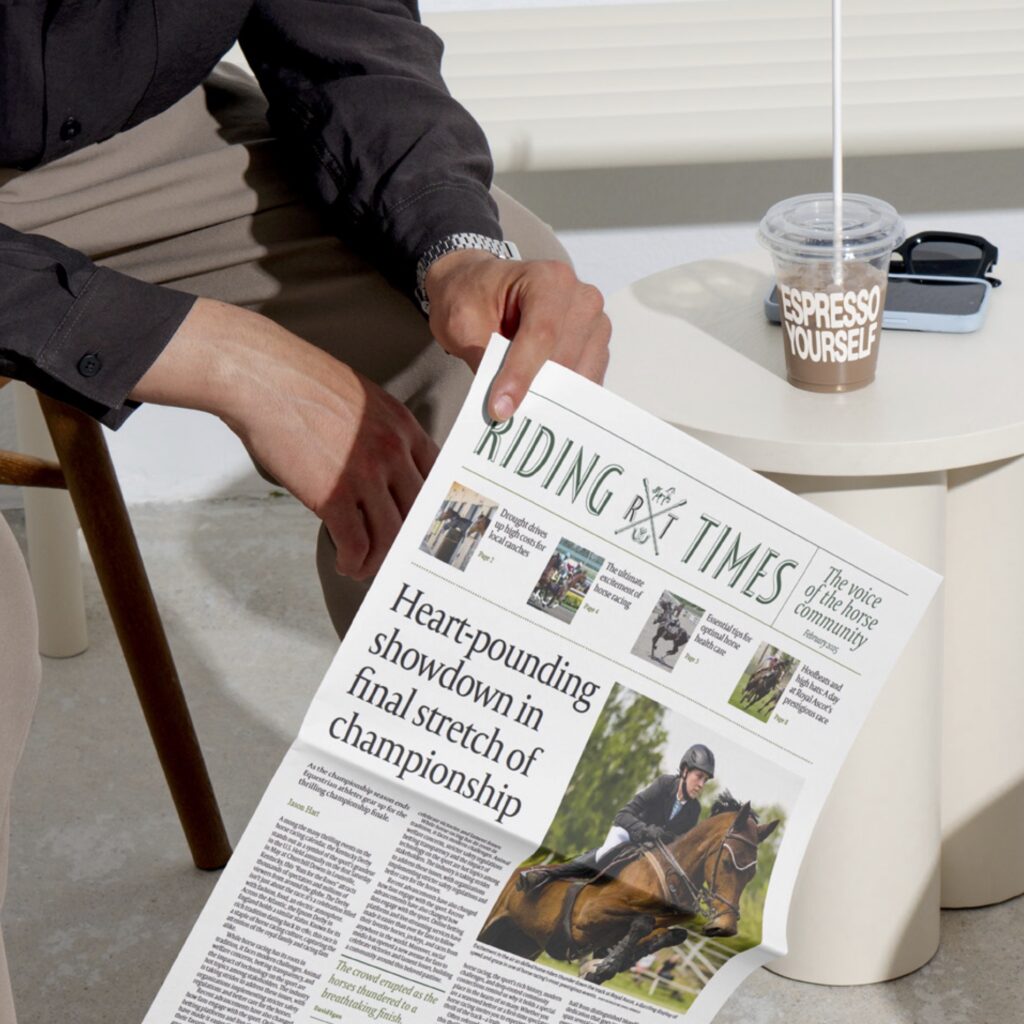
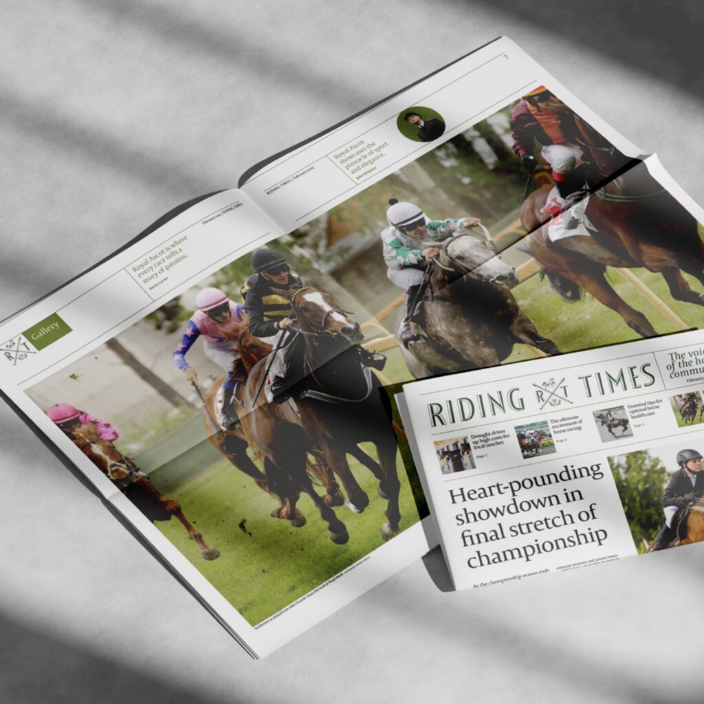
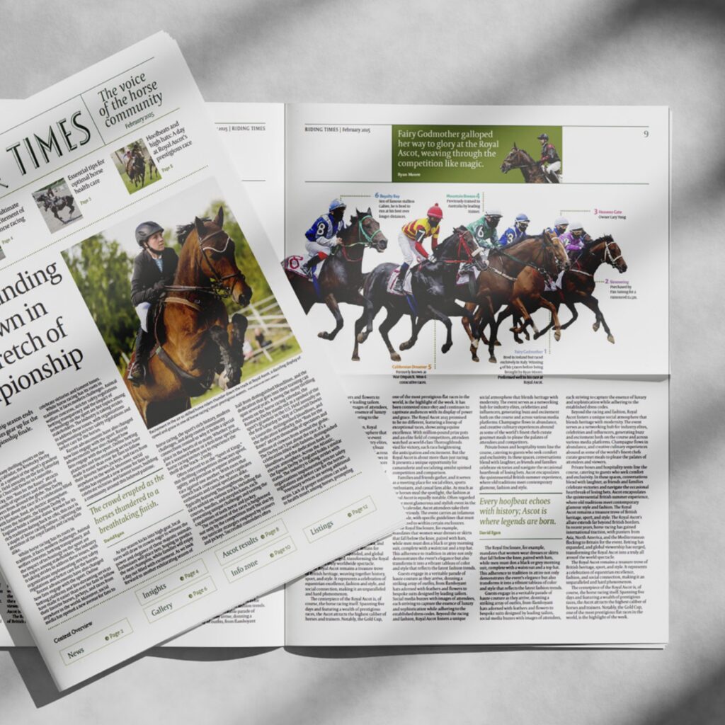
Riding times is a newspaper dedicated to horse competitions and news, featuring Ascot results and race listings.