Luca Ferrara

Luca Ferrara

Hi! I’m Luca Ferrara, a design student with a love for storytelling through visuals. I enjoy exploring how design intersects with culture, identity, and narrative – whether through print, branding or creative research.

Warner Gin redesign

For this brief, I reimagined the Warner’s Gin brand. While the initial focus was the label design, I quickly realised the brand’s story and heritage were just as important. Researching its roots shaped the visual language and led to a more authentic and meaningful final design.

The Milanese

The Milanese is a newspaper concept for tourists or business travellers wanting to dive deeper into Milan’s culture. It features curated content ranging from local food and daily news to city insights – designed to reflect Milan’s elegant yet vibrant identity.

Zaraah Gracias

Zaarah Gracias

Hi, I’m Zaarah, a passionate graphic designer with a strong interest in branding and packaging design. I’m dedicated to combining creativity with strategic thinking to produce visuals that communicate clearly and effectively. Throughout my studies, I have developed skills in Adobe Photoshop, InDesign, Illustrator, and Figma. My time at university has helped me refine these skills and shape my approach to design, preparing me for future professional challenges.

Beyond the Streets

Beyond the Streets is an independent magazine dedicated to the vibrant world of graffiti and street art. Each issue dives deep into the aesthetic power of urban creativity, its impact on social activism, and the ever-evolving future of this dynamic culture. Packed with vivid illustrations, bold layouts, and striking photography, the magazine captures the raw energy and cultural richness that define street art today. Designed to balance visual excitement with clarity, every edition offers readers a fresh, immersive experience that pushes the boundaries of traditional publishing.

True Tea

A set of Indian luxury tea boxes designed as a packaging redesign for True Tea.
This project draws from India’s rich heritage of textiles, natural ingredients, and brewing rituals to infuse each box with authenticity and elegance. Through intricate illustrations, refined typography, and carefully selected finishes, the redesign reimagines how culture and craftsmanship can be expressed through packaging design.

Tilly Dobson

Tilly Dobson

I am an ambitious and creative individual driven to find innovative solutions and deliver impactful designs. I actively seek opportunities to expand my skills across diverse design areas and thrive in challenging environments. I’m soon to be a graduate of Typography & Graphic Communication from the University of Reading. This BA degree has strengthened my confidence in public speaking, and my ability to manage multiple tasks, enhancing my organisational skills.

I Am... Earth Wind & Fire

A re-design of Earth, Wind and Fire’s album cover for ‘I am’. The Visual concept demonstrates the ethos and identity of the band which combine music genres, including R&B, soul, jazz, disco, funk, rock, and Latin. The Vinyl includes a strong, engaging diecut of the name of the album and band, revealing a pattern which is multifaceted and exuberant.

Recallr

Recallr is a memory app that helps those who are worried about developing dementia by providing them with daily tasks to engage their personal memory. Recallr successfully captures users through connecting their personal photos and music and embedding these into features.

Aaron James

Aaron James

I am a motivated and creative Graphic Designer studying at the University of Reading, with a strong foundation in visual communication and a growing expertise in both UX design and branding. I specialise in translating complex problems into intuitive, user-centred solutions while building cohesive, impactful brand identities.

Listen UX

Caption

Promoting Global Goals

Caption

Alice Lofting

Alice Lofting

Wasson, I’m Alice. I am a designer who is passionate about users and making an impact. Throughout my time at Reading, I have built strong foundations within UX design and also developed a love for all things printed. I pride myself not only on my resilience and versatility in life but also on my ability to harness lived experiences and use them to make more informed design choices.

Looking to the future, I am keen on pursuing a career that allows me to explore information design and UX/UI design in a professional setting; but also the freedom to take on a variety of briefs. I am a creative problem-solver that enjoys continual learning and growing, individually and within a team.

Dubpack

Dubpack is a periodical magazine covering all aspects of drum and bass and rave culture. Each issue champions artists of various followings, supporting the grassroots scene and giving voices to the underground. Dubpack is more than a magazine; it is a handbook for anyone in the scene and anyone wanting to get involved.

Dubpack tackles all topics from drink spiking to the best producing plug-ins for budding producers and prides itself on its ability to welcome all, just like you’ll find in the rave.

Enter the Wu-Tang (36 Chambers)

Redesign of Wu-Tang’s debut album, ‘Enter the Wu-Tang (36 Chambers)’. The initial redesign is of the vinyl sleeve. To create strong visual links to the music on this record, the design aims to home in on the raw and gritty elements of the album while also staying faithful to the overall brand that is Wu-Tang.

Mathew Lui

Mathew Lui

Hi, I’m Matthew Lui, a designer with a focus on Editorial Design and User Experience Design. Over the past three years at the University of Reading, I’ve developed strong editorial design skills by combining typography, layout, and imagery to create a range of printed materials – from published books to student-led poster projects. These experiences have allowed me to work closely with authors and clients, giving me valuable insight into real-world design and publishing. I’ve also developed several UX prototypes, where I learned the importance of competitor analysis, creative problem-solving, inclusive design, and always putting the user first. Through these projects, I’ve gained proficiency in Adobe InDesign, Photoshop, Illustrator and Figma, as well as essential time management skills – balancing multiple projects under tight deadlines, both independently and within a team.

Bayeux Tapestry Academic Publication

Reproducing the Bayeux Tapestry Over Three Centuries is a design of an academic book that explores how the Bayeux Tapestry has been reproduced from the 18th to the 21st century. The book, authored by Professor Emeritus Michael Twyman and published by the Printing Historical Society in 2025, examines the evolution of printing methods and their impact on the tapestry’s visual representation.

Atomus

Atomus celebrates the retro-futurist aesthetics of the mid-twentieth century, capturing the unique blend of optimism and anxiety that defined the Atomic Age. Our mission is to inspire artists, designers, and writers while preserving the cultural legacy of mid-century futurism for enthusiasts and scholars alike.

Celeste Clift

Celeste Clift

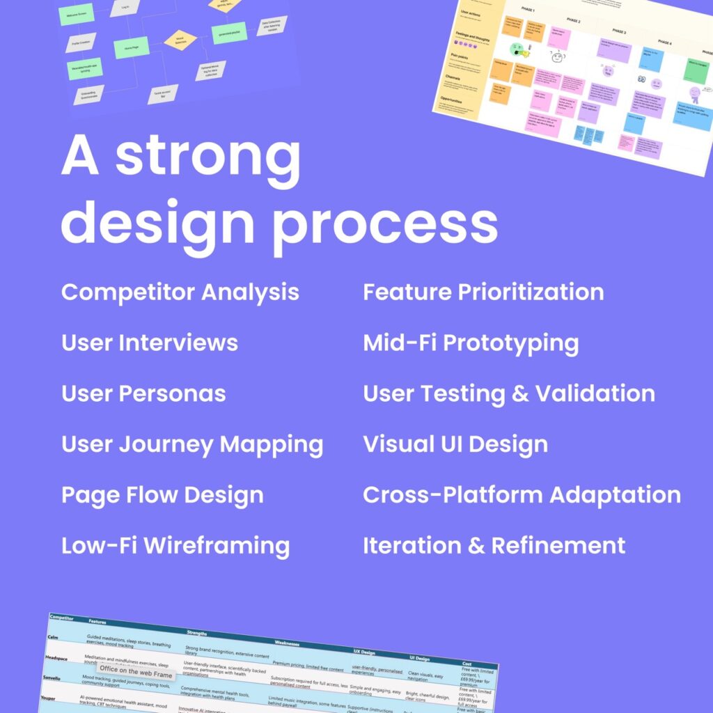
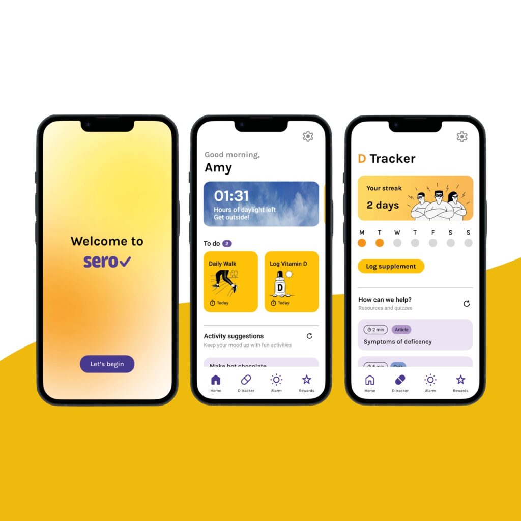
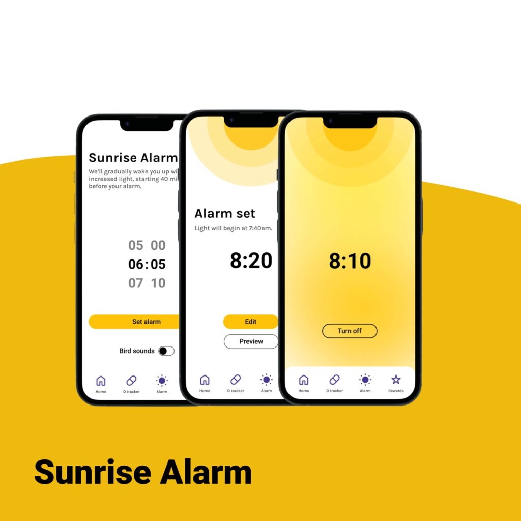
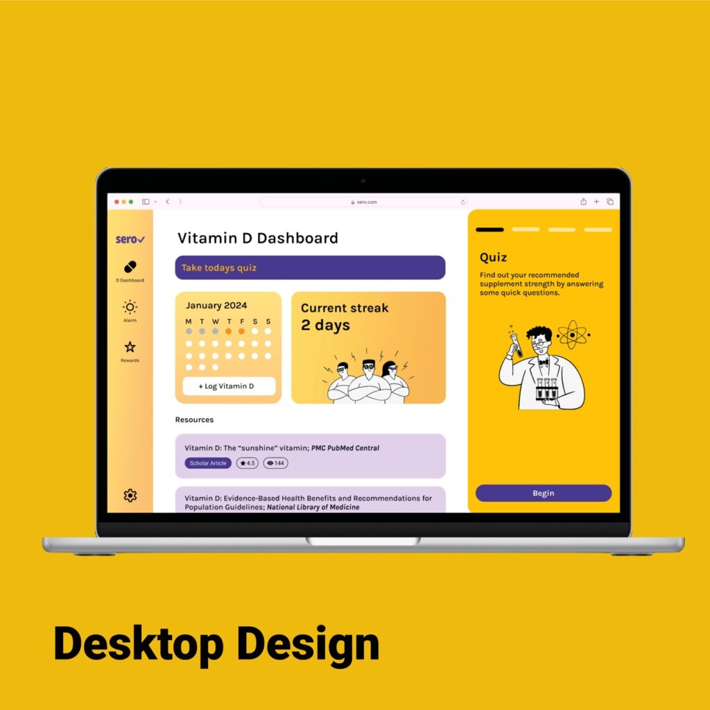
My design work is always strongly informed by research, whether that’s user interviews, competitive analysis or contextual research. Before jumping into visuals, I take time to understand who I’m designing for and what problems need solving (a skill which was crucial in my design of Sero!).

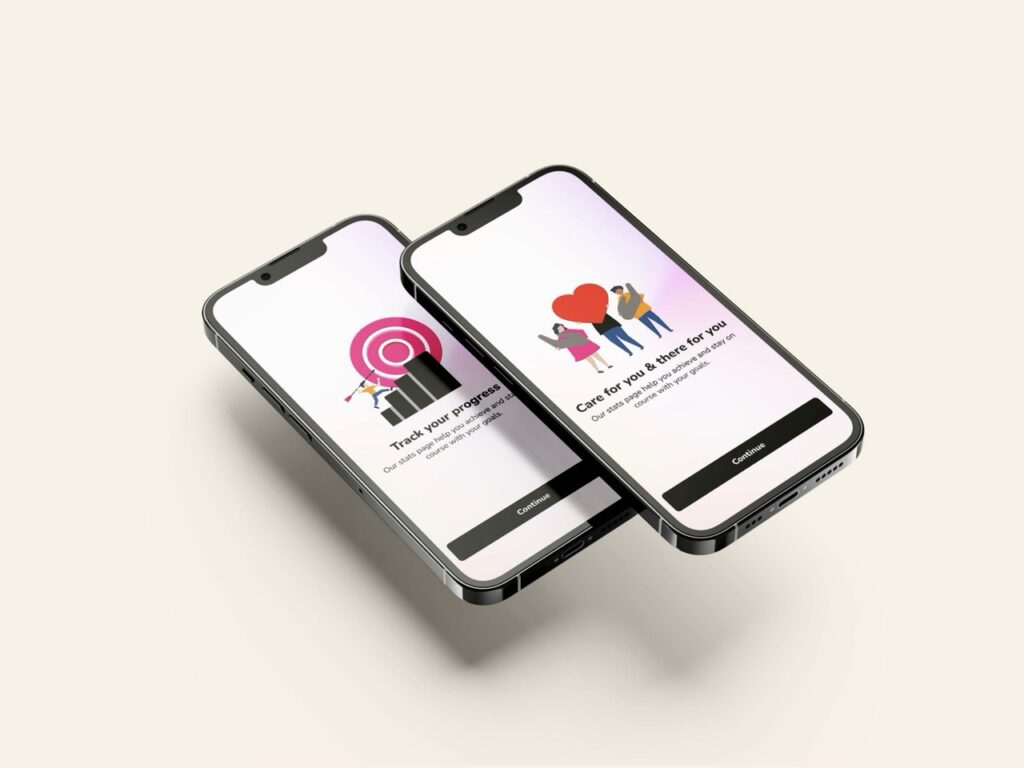
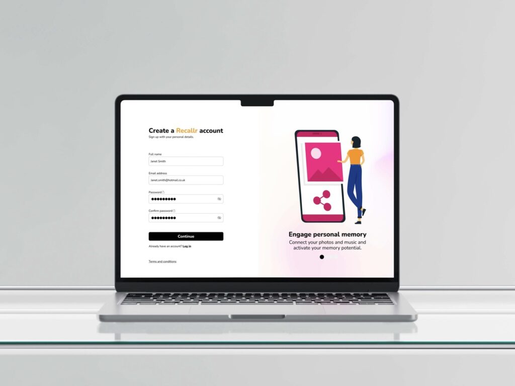
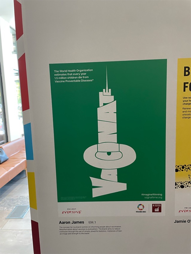
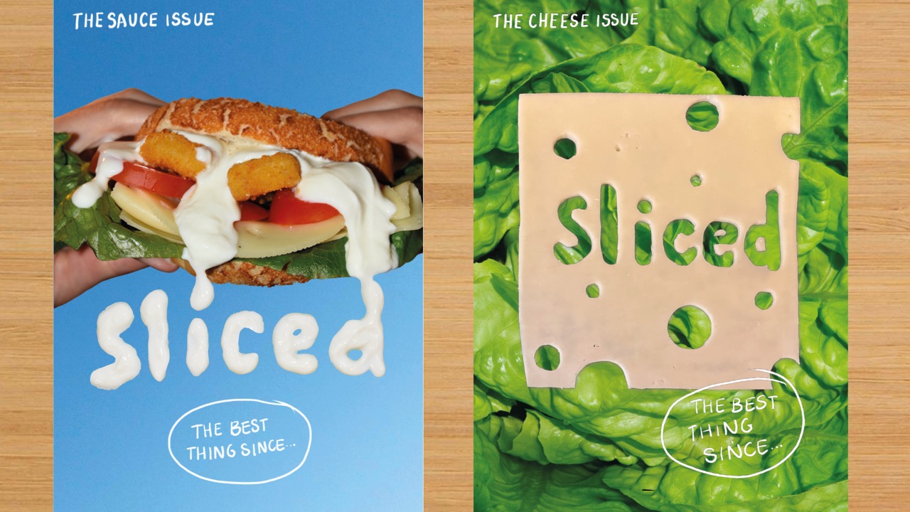
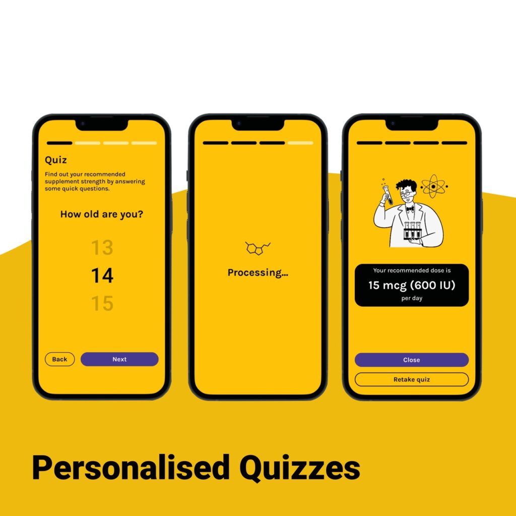
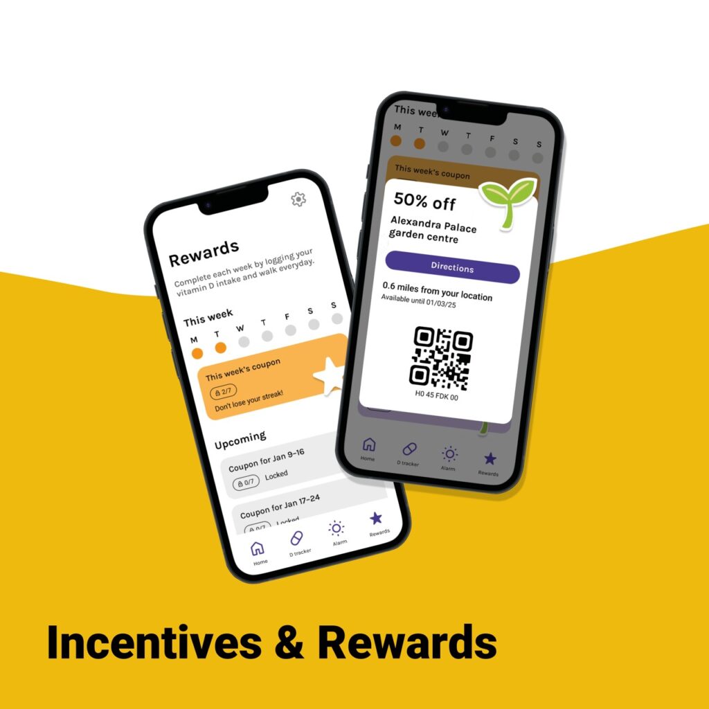
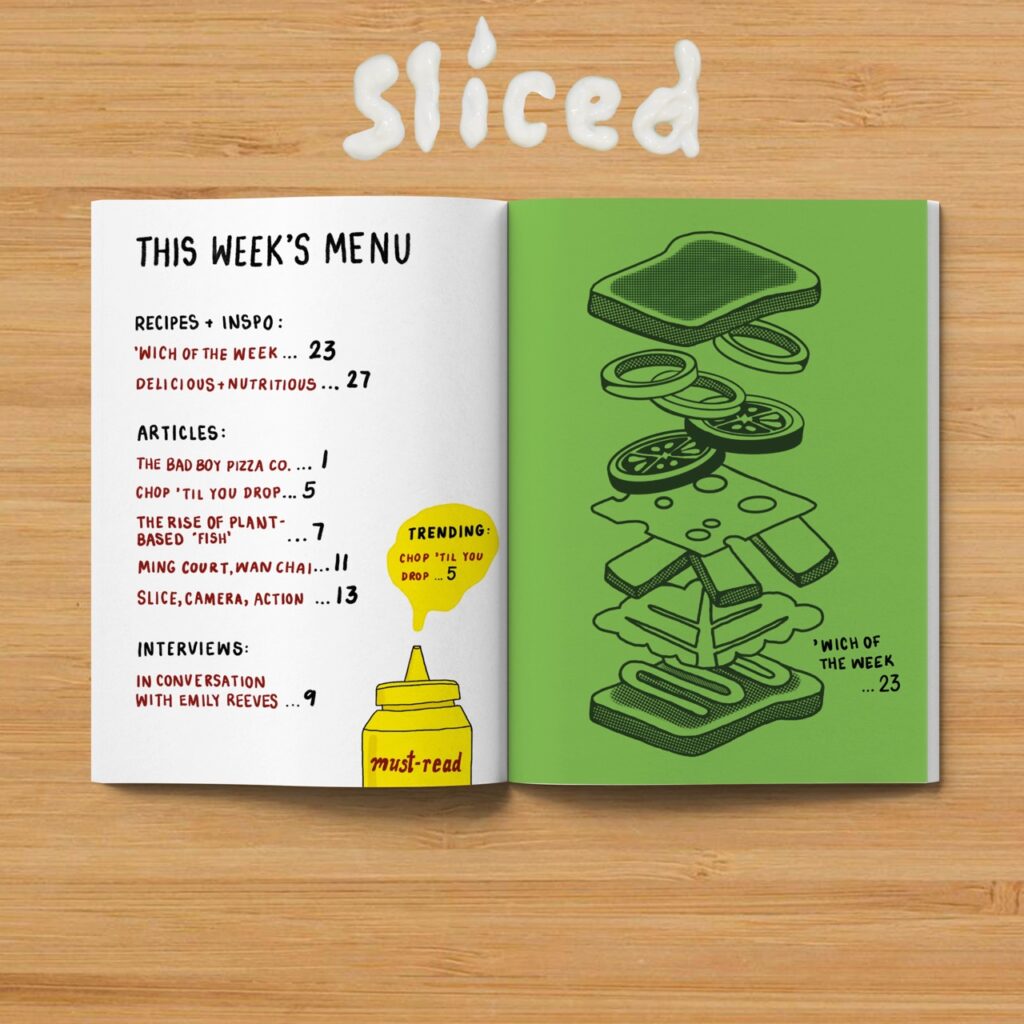
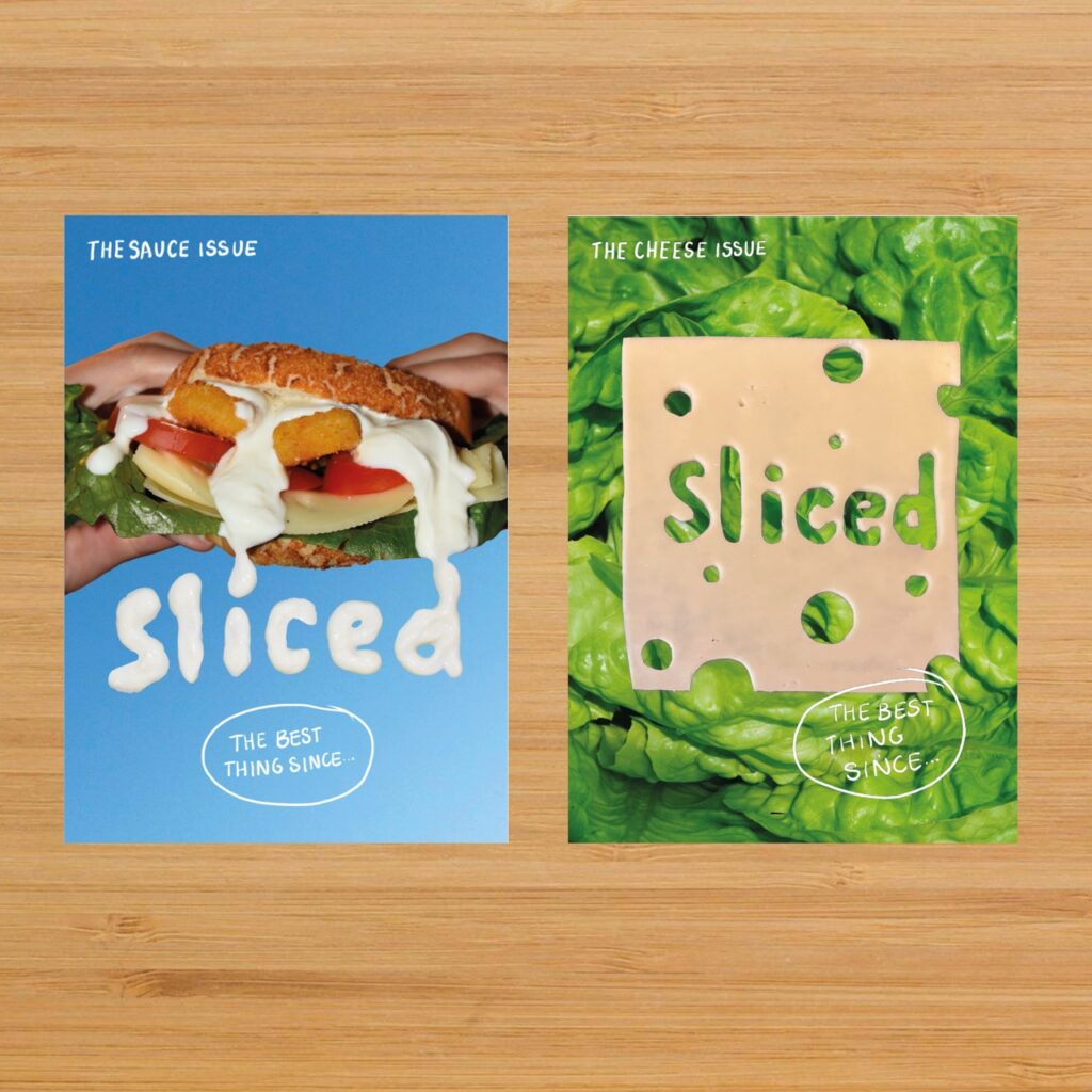
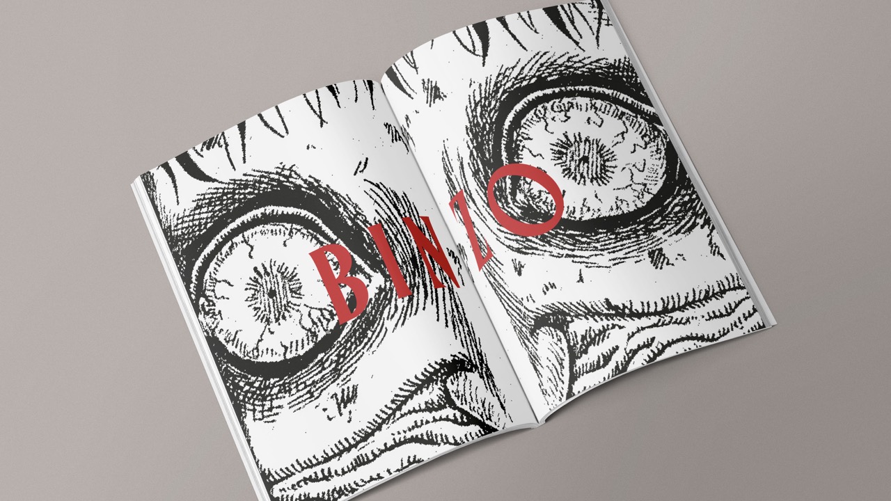
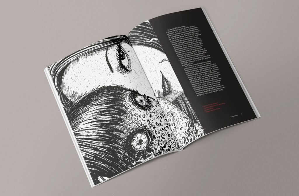
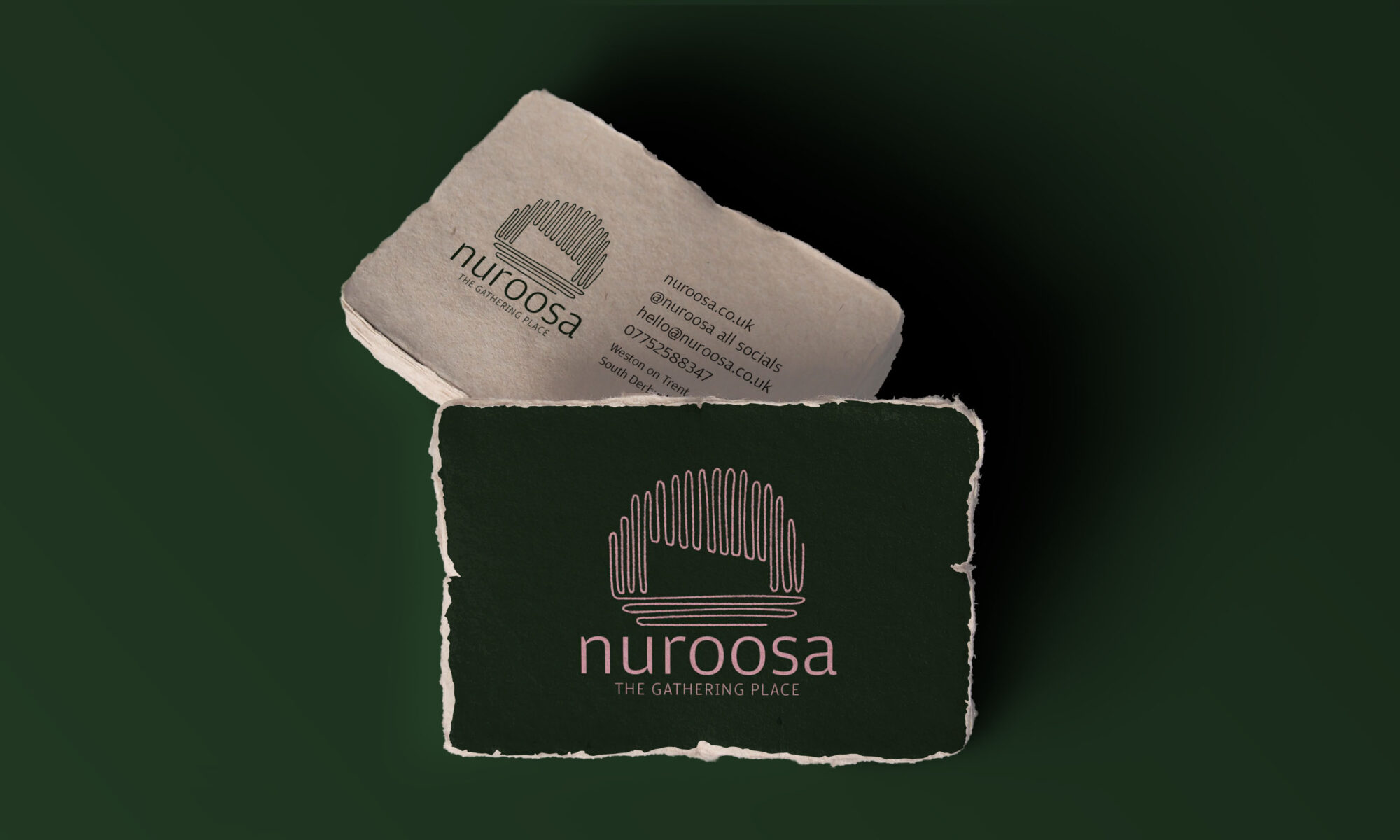
I also love to incorporate my hand-drawn illustrations into my work, adding visual flair through custom icons, character work, and detailed graphics. When paired with clean typography and design, I find that using illustrations helps to make information clearer and more engaging. These hand-drawn elements often help me to bridge the gap between complex ideas and user understanding.

Sero

Sero is a multi-platform app which helps users to improve their mental & physical health over winter. With features such as vitamin D tracking, a sunrise alarm and a daylight countdown, Sero keeps users accountable whilst proving a positive and engaging user experience. Featuring friendly, hand-drawn illustrations and a warm colour scheme, the design of Sero makes scientific information accessible and engaging for it’s users.

Sliced Magazine

Sliced is an independent magazine for sandwich and design lovers alike. Each issue serves up engaging stories paired with striking photography and hand-drawn illustrations balanced with clean typography.

Jony Hodgson

Jony Hodgson

 I am passionate about creative design and always on the lookout for innovative ways to solve problems. I love editorial design and enjoy crafting unique, meaningful visuals that stand out. I prioritise intentionality in my process, ensuring every piece has purpose behind it. Confident in Figma and AfterEffects, with a strong foundation in Indesign, Photoshop and Illustrator – always eager to learn and expand my skill set.

Boundary Magazine

‘Boundary’ is a magazine that puts the spotlight on otherwise unknown areas of club level cricket. It is photography intensive, featuring photo essay articles as well as interviews and a deep dive into each issues genre. Issue 1 focuses on groundskeeping. Users would sign up to receive this magazine via delivery and it would arrive in a custom designs protective packaging.

Linkin Park Papercuts redesign

A hypothetical ‘limited edition’ album that would be released alongside Linkin Park’s latest compilation album, ‘Papercuts’. This design uses gritty and raw textures combined with paper stock and graffiti art to shape a core aesthetic retention from all of Linkin Park’s previous album art. The secondary deliverables for this project were a social media campaign and a product launch website.

Aina Zain Azrin

Aina Zain Azrin

I have a passion for book cover and packaging design. I enjoy incorporating different imagery, manipulating typefaces and shapes to create interactive elements for a communication with audiences.


Twisted Pages magazine

Twisted Pages dives us into the world of Junji Ito’s universe. Not only is it a space for Junji Ito enthusiasts but also a place for art and horror (or both!) fans who are interested in the grotesque visual details and stories. It explores his artwork, manga picks for the month and as well as articles about live events and exhibitions about his universe.

Princess Mononoke

Princess Mononoke is a Studio Ghibli film directed by Hayao Miyazaki. Their orchestral film score was composed by the talented Joe Hisaishi. I redesigned the album packaging to focus more on the spiritual and natural theme, with elements that appear in the film. It leans more towards mystical visuals to communicate about the contents of the film and music.

Finn Lewis

Finn Lewis

Hello! I am a passionate graphic design and digital product designer.  

During my studies I have developed my typography skills, my UX and web development skills which I specialised in during my semester abroad and produced full brand packages for two live businesses.

I firmly believe that as a designer all visual content I produce must serve to provide a function while maintaining a visually striking form.

Sneaker Pimps, Becoming X redesign

In this project I set out to redesign the cover of Sneaker Pimps’ debut album Becoming X, releasing a limited edition LP in line with the albums 30 year anniversary in 2026. 

With the aid of multiple generative AI tools, I was able to create my idea of a miniature nostalgic green soldier figurine of the band’s lead singer Kelli Ali. This solution creates a transfixing unusual image, both intriguing and unnerving, really suggestive of the eclectic trip-hop genre, but specifically of Sneaker Pimps’ sound.  

Further from the album cover I built a visual identity around this base idea, creating a zoetrope animation record, intuitive A and B side stickers, a collectable toy and a product launch site.

Nuroosa: The Gathering Place branding

Nuroosa: The Gathering Place will be a venue hiring business opening in Spring 2026, with one modern building which shall accommodate weddings, wakes, corporate get aways, and well being visits. 

Nuroosa also aims to be as sustainable as possible. Surrounding the building is lots of green space, with flowers, trees and grass.  

The project outcome focused on the venue space, with an abstract shape of the building made from the negative of fluid, natural lines. These lines emulated the trees and natural environment of the venue, while are also suggestive of the companies values of growth and sustainability.