Olivia Moors

Olivia Moors

Hi I’m Olivia! My ambition is to use my design skills to create a positive impact on society. Through close work with Project Everyone and the Global Goals, I have developed compelling concepts which encourage people to reflect on their environmental impact. I am a companionate designer, I can empathise with my client or audience to develop outcomes which improve their day to day lives. My creative capabilities are versatile, but I enjoy developing bold, outstanding and honest visual designs.

Grace & Green

Grace & Green are a period care company who sell organic, sustainable period products to provide comfort for all genders and help protect the planet. After gaining first hand research from the target audience, my goal was not only to reinforce these values but to represent menstruation in an honest light, to help bring us one step closer to ending period stigma.

Flip Magazine

A magazine for children and adults interested in gymnastics, from tips and tricks on how to learn new skills, to inspirational stories from famous gymnasts. Making compelling use of the ambigram concept in the masthead, intentionally crafted to make readers reconsider how they engage with the magazine from the start, while also reflecting the experience of gymnasts, who are frequently up-side-down!

James Page

James Page

Hi, I’m James, a very passionate designer, interested in creating experimental and visually intriguing designs.

Vision Magazine

Through ‘Vision’, I strive to inspire young designers who haven’t explored experimental graphic design yet. My goal was to craft unique visual narratives through objects I find in my everyday life.

Utopia

Redesign of Utopia album packaging by Travis Scott. I visualised the atmosphere of the music. Using the three words; experimental, dystopian, and imperfect.

Geena Sharma Singh

Geena Sharma Singh

Hi, l’m Geena! I’m a designer with a background in photography and videography. I’ve spent 3 years working in marketing and I did a placement year creating content for internal communications. My time at Reading has allowed me to hone my editorial skills and get a solid grasp of working with InDesign to a professional standard. I’ve been using Photoshop and Premiere Pro for 8 years and I am also a confident user of InDesign, Illustrator, Lightroom and After Effects. I have a particular interest in editorial design, packaging design, video editing and events.

Pink Pony Club

Pink Pony Club is a LGBTQ+ focused newspaper sharing good news and LGBTQ+ wins from across the world. The name comes from Chappell Roan’s song which has been one of the biggest queer anthems of this year. This was a really exciting project to work on as I was required to work to a high-technical standard with very organised design files in order to create a template and specification that could be used by others. The skills I learnt from working on this module have been invaluable to my experience as a designer.

CAii

CAii is a self-titled album by the Manchester-based alternative pop artist. This was a fun project to work on as it allowed for a lot of creative ideation and I also got to be ambitious with one of my additional projects and decided to make a collectible ‘coffee table’ photo book with lyrics and some ‘behind the music’ stories. This was a fun opportunity to also incorporate some of my own photography into my design work as I’ve done a lot of photography with her over the years. I revisited the design of this after my Advanced Editorial module and was able to apply the skills I’d gained on the module to elevate the final design.

Ben Sturgis

Ben Sturgis

Hi, my name is Ben Sturgis, and I am a graphic designer with big aspirations. During my time studying Graphic Design and Communication at the University of Reading, I have developed a strong design skillset that can be used across a multitude of platforms. My passion is branding, I find it fascinating how a strong visual identity and brand can help strengthen customer relationships and grow any type of business or company. This skill is what I look to bring into the real world to help influence and shape the world around me.

Tag Magazine

Tag is the outcome from a magazine project I made covering the work of Banksy. This includes three articles and three cover proposals for diIerent magazine editions. This was then printed out and bind together by me. This taught me a lot about typography, page layouts, and how to design across a multitude of spreads while keeping the same visual identity.

True Tea

This project involved finding a company and redesigning some of their packaging. I chose to make a set of three new tea flavours for True Tea along with corresponding tea bag packaging and a new loose leaf tea tin. This was one of my favourite projects to date as I was able to work with tea, one of my favourite commodities. This packaging is supposed to cater towards people that may not know a lot about tea as from my research I discovered that 75% of people have never bought fruit tea. I therefor decided to make things clear on the packaging, showing a clear graphic of the flavour along with its profile on the bottom, and an image of the tea in the bags so they know exactly what they are drinking. This was shown to have been a great success as people who had never tried fruit tea said they were able to know instantly what the product was and felt inclined to try some.

Alice To

Alice To

Hi, I’m Alice!
I’m a graphic designer with a strong focus on typography, color, and typographic hierarchy. My passion lies in editorial design, where I enjoy transforming ideas into beautifully crafted printed materials. I’m skilled in both print and web design, enabling me to create cohesive and engaging experiences across various platforms. With a keen eye for detail, I strive to deliver unique solutions that truly resonate with my clients and elevate their projects.

Coffee Under Pressure

This repacking project for the independent coffee shop Coffee Under Pressure in Reading features an abstract design approach. I incorporated a large “CUP” graphic on the deliverables, using vibrant colors to create a striking contrast. By treating type as an image, the design achieves an abstract quality while remaining legible upon closer inspection. This reflects the energetic and unique spirit of the coffee shop, aiming to enhance the customer experience.

Home Kong Magazine

Home Kong is an independent magazine that visually presents Hong Kong’s vibrant food culture, highlighting traditional restaurants. It features articles on the significance of cha chaan teng in Hong Kong culture and the rich history of classic old shops. Named to reflect Hong Kong’s multicultural essence, the magazine aims to convey the message that everyone can make Hong Kong feel like home. By incorporating personal connections through illustrations, I strive to showcase the city in a classy way and celebrate its diverse culinary heritage.

Riya Vashistha

Riya Vashistha

Hello, I am Riya! I have a keen interest in design thinking, visual communication and printed mediums, alongside with typography and illustration. Over the years of studying at the University of Reading, I have learnt various design practices in-depth, that have allowed me to broaden my skillset and knowledge in design across different mediums. I am inquisitive about developing my skills constantly as a designer and would love to collaborate with and learn from people in various industry sectors and fields of study.

Mysore Sandalwood

Mysore Sandalwood is an iconic local brand from the state of Karnataka, India, that has a rich history of producing sandalwood soaps and other cosmetics/fragrance products from 1916. I wanted to re-design the packaging of their three iconic products: soap, body wash and incense sticks, focusing on maintaining a historical flair, taking inspiration from the history of Mysore and 1980’s Indian match box designs.

Sanctum of the Curious Magazine

Sanctum of the Curious is a biannual, independent magazine, revolving around all things occult, oddities and curiosities, exploring unique (or strange) practices, rituals, mythology, beliefs and superstitions. Each edition focuses on different parts of the world and/or countries, diving in the strange traditions that took/take place, alongside exploring hidden parts of various cultures. This magazine caters to people who are interested in such curiosities and would like to explore different mystiques around the world.

Jack Swain

Jack Swain

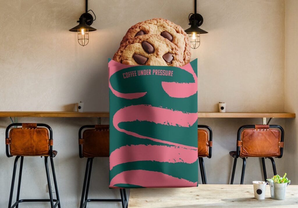
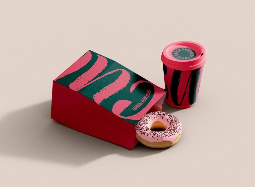
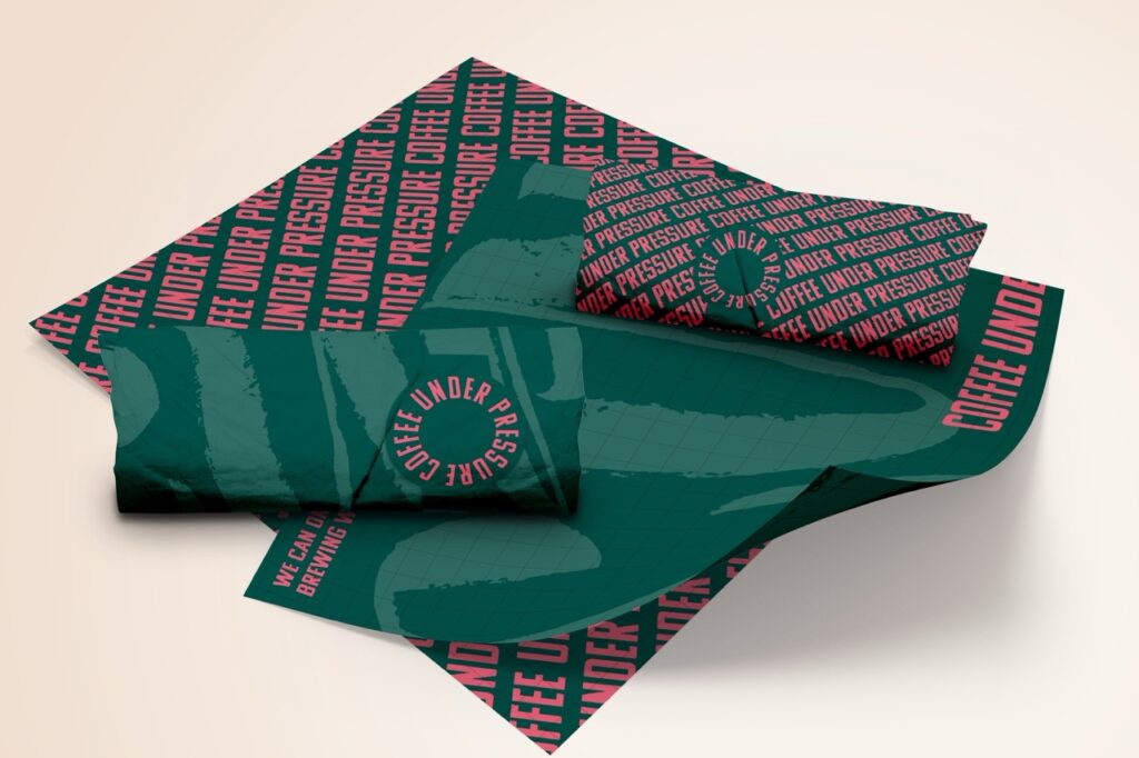
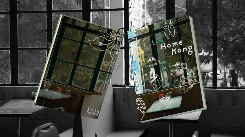
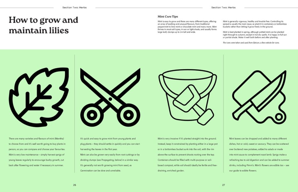
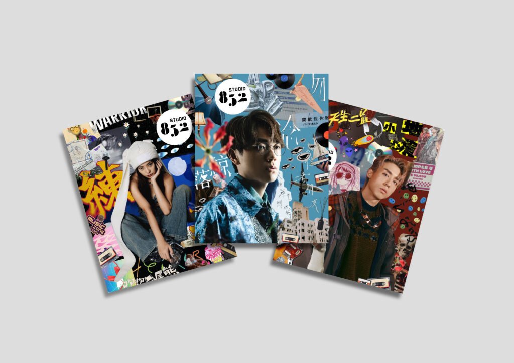
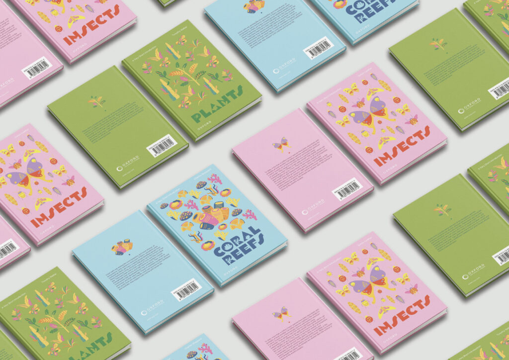
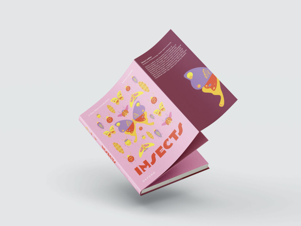
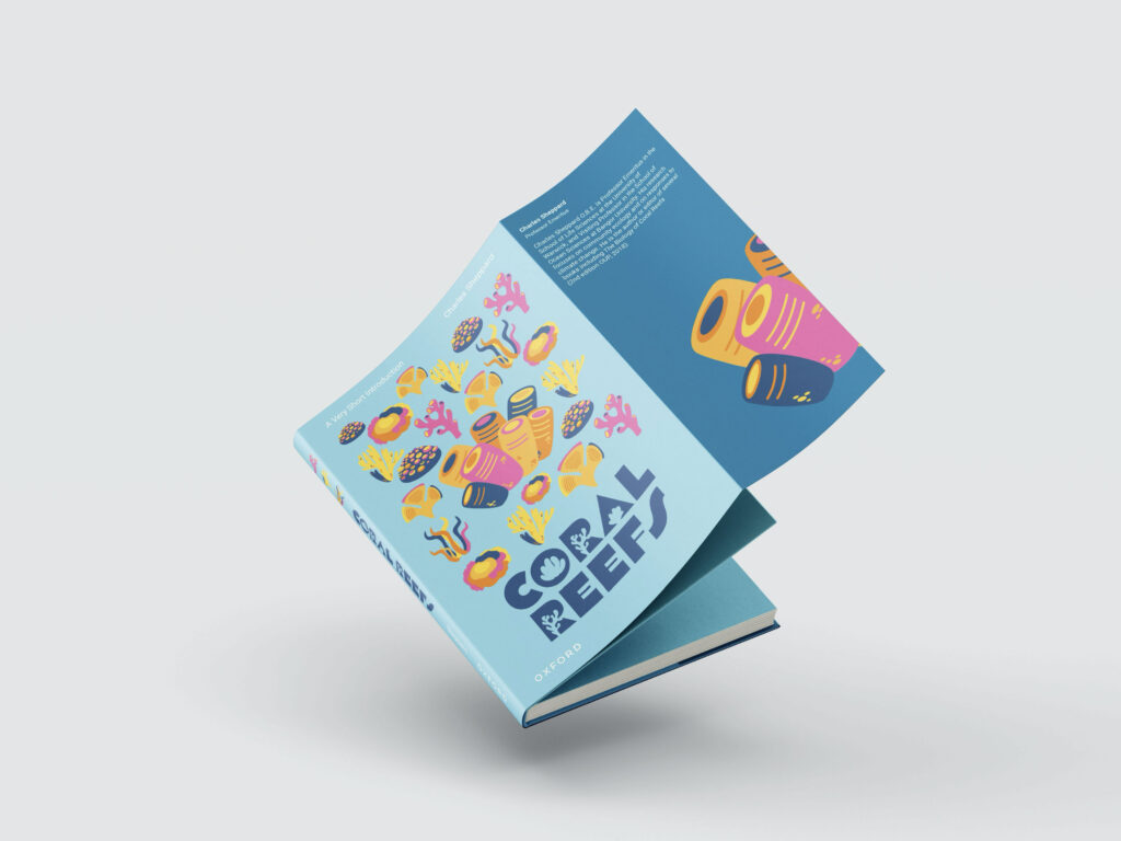
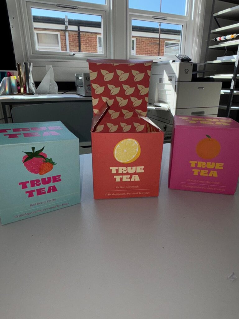
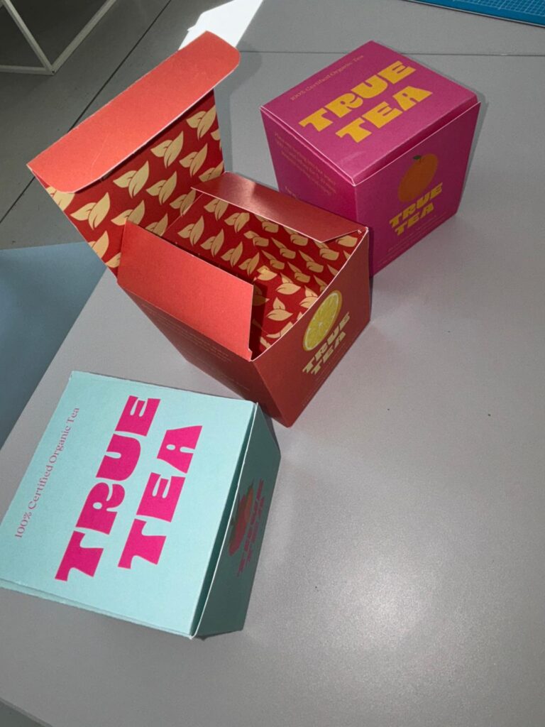
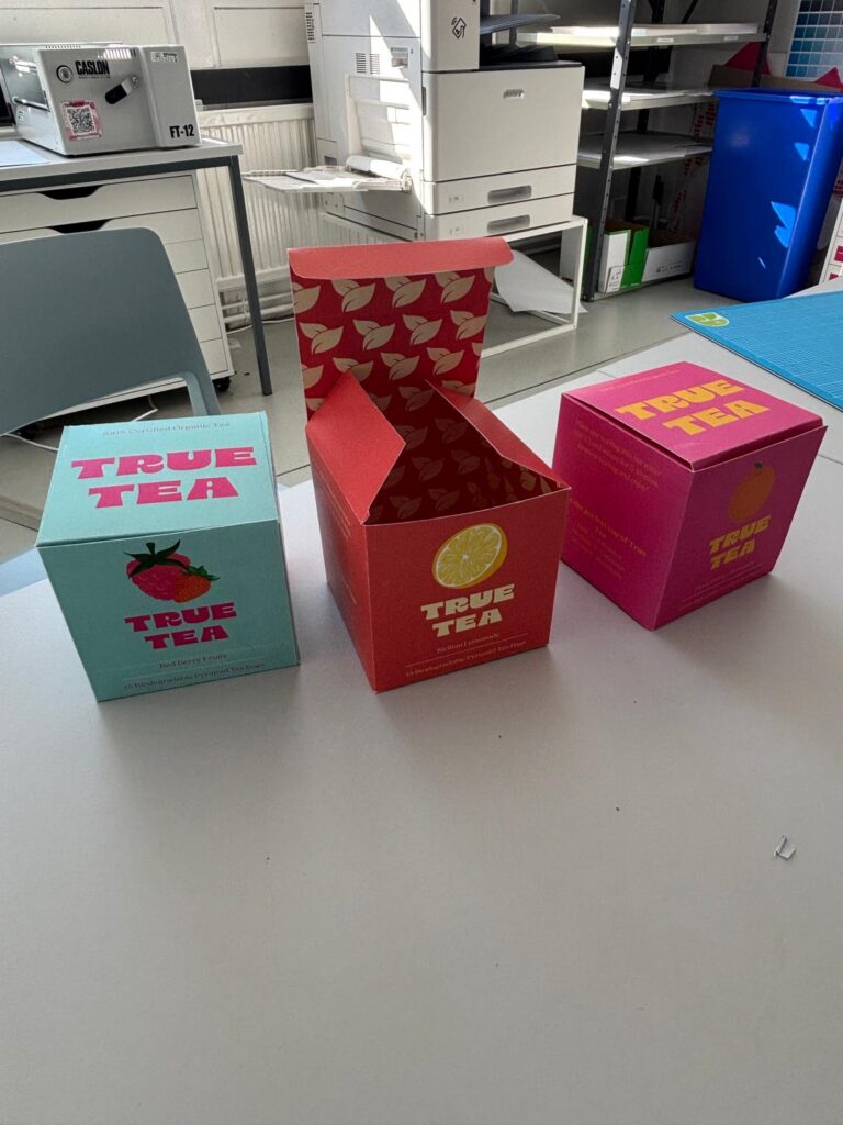
Hi, I’m Jack, a designer with a passion for creating exciting visuals that toy with colour, layout, and texture. During my time studying at Reading, I have developed a strong typographic skillset and a versatile design mindset that has been put to use with real world clients. I enjoy exploring different design styles and mediums to create work that’s both impactful and unique, yet applicable to real world design solutions.

Forte Magazine

Forte is a magazine designed for music enthusiasts. It aims to shed light on smaller artists, cult favourites, hidden gems, and under-appreciated projects. Each issue covers a different genre and features album reviews, artist profiles, interviews, and exciting imagery.

Featured here are a range of cover proposals for different issues, and the inside pages for the Hip Hop Edition.

Deftones re-design

A re-design of Deftones’ compilation album ‘B-Sides & Rarities’ with accompanying music video DVD. The visual concept takes on overlapping faces, particularly eyes and mouths, to match the deep layered aesthetic of the music, and the emotionally charged themes throughout the album. The DVD cover acts as a removable lyric booklet, creating a more interactive experience with the product.

Karissa Ng

Karissa Ng

Hi, I’m Karissa! I’m especially interested in branding, packaging, and print design. I enjoy combining my illustration skills with design. During my three years at Reading, I’ve explored a variety of design areas and developed not only my technical skills but also an understanding of how to meet client and user needs. I’m excited to take what I’ve learned and contribute fresh ideas and creativity to the industry.

Studio 853 Magazine

Studio 852 presents Cantopop, a magazine dedicated to raising awareness of the Hong Kong music industry. Named after Hong Kong’s telephone code, the magazine explores a different theme in each issue, featuring articles on new music releases, industry news, artist interviews, and upcoming event listings.

Oxford University Press book covers

A series of three book covers has been redesigned for Oxford University Press ‘A Very Short Introduction’, featuring the titles ‘Coral Reefs’, ‘Insects’, and ‘Plants’. The design concept draws inspiration from encyclopedia to convey the idea of presenting new knowledge to readers. I created the illustrations myself, aiming to appeal to a broad age range. In addition to the covers, a series of laptop stickers were designed as marketing materials to help promote the books.

Lovell Nanditta

Lovell Nanditta

I have a deep appreciation for storytelling through design and I’m especially drawn to editorial and magazine work, where visual narrative takes centre stage. While I enjoy exploring packaging, my true creative drive lies in crafting bold, engaging stories through print and editorial design.

Disorderly Magazine

Disorderly Magazine is an independent streetwear publication created in response to the lack of representation in traditional fashion media. Most fashion magazines focus on mainstream, high-end fashion that is often expensive, exclusive, and targeted by and for wealthy A-list celebrities. Disorderly shifts the focus to and for real people, fashion influencers and everyday individuals whose style shapes the streets. It’s for those passionate about current streetwear trends, hidden gems, and raw, authentic inspiration. Rooted in culture and driven by individuality and confidence, Disorderly celebrates fashion that feels real, not rehearsed.

True Tea

This is a packaging redesign for True Tea, a company with an extensive range of teas. This design focuses on a 3-pack fruit tea collection, with the goal of making the variety of flavours immediately visible and recognisable at first glance.